
To date we have looked at initial considerations, questionnaire design and data analysis in R for our Wellness system. Today we will start to build the reporting section in PowerBI. We will be using the PowerBI desktop version which unfortunately cannot run on Mac however the use of Parallels can facilitate this.

Connecting Sheet to PowerBI
There are a few ways to carry out this step, I’m going to try and cover a few potential steps involved in performing it as it will hopefully overcome any issues you may encounter.
Before we start to connect the sheets, it may be worthwhile formatting the Timestamp column in the googlesheets to the desired format as R/PowerBI can be weird (technical term) with datetime data at times. To do this:
- Highlight Timestamp column
- Select Format
- Change from current format to Date

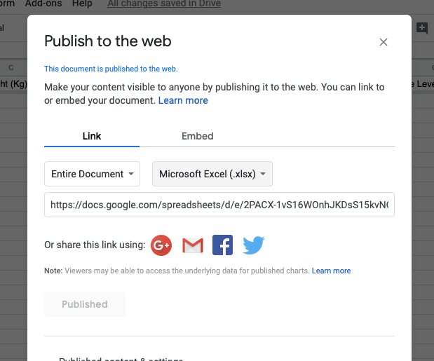
To link our data to PowerBI, first we must go into google sheets and copy a link for the page as an excel sheet.
- File ->> Publish To The Web
- Change from Entire Document to desired sheet
- Change web-page to Microsoft Excel
- Copy link provided
- Open PowerBI
- Under “Get Data”, select “Web”
- Insert URL link to sheet
- Select desired sheet to load
- Edit in the bottom right corner

Now your data should load into a Query screen within PowerBI.

Straight away we can see issues that can be dealt with quickly through Query alone (If new to Query see 1, 2, 3, 4), .
- Unwanted columns
- To remove, select desired columns, right click, remove columns
- First row as headers.
- To promote, select transform, first row as headers
NOTE: We will leave Timestamp as a character variable (ABC) for now as datetime data must be in character format before we use R in PowerBI (known issue)

Previously we looked at automating the analysis of googlesheets data in R, now we need to implement that analysis in PowerBI. Under the Transform option, on the far right we also have the ‘Run R Script’ icon which we will now use. If R is not present within your PowerBI, see here for potential solutions. Some points to note before implementing R:
- Keep R for analyses or steps that are not possible or time consuming in Query. R can be tempermental in PowerBI, avoid unnecessary use
- Make sure you load packages using the
library()call at the start - Avoid working with datetime data through R as mentioned
- You may need to use
as.numeric()withinmutate()for some variables. - Check your data for
NAvalues following an Rscript as these will cause PowerBI to read your data as character

The first line here means we must refer the data as ‘dataset’ similar to how we would refer to any data frame within the R environment. I wrote and tested the RScript in Rstudio before copying and pasting into PowerBI, as PowerBI does not have the same helper features present. It’s probable that you will initially get errors when you try to run the Rscript, unfortunately it’s a case of working through them one by one until the script runs. At the very bottom of the error message is where the cause will be. If, no matter how many efforts are made, errors continue to appear then it may be more practical to use Rstudio to download and manipulate the data, store it as CSV file and pull the CSV into PowerBI then. Although slightly more time-consuming, due to the additional step, it is still a very workable solution.

If you are familiar with using the source()function in R, this can reduce the need for work in PowerBI. Similarly, if you have a lot of functions you wish to use then devtools::source_gist()along with gists is another option.
PowerBI
Once you have the data loaded into PowerBI and are in the PowerBI interface, you should have a list of data loaded on the right and a blank canvas to work with.

We are going to create two pages here: one where all athletes are present and one for a single athlete.
All Athletes
First we will create a table using the table icon from the Visualisations pane

To add data to your table, simply click and drag the desired data from the Fields pane into your table.

Date may load in a hierarchal manner first (Day, Month, Year etc. separate). To change this, select the drop-down arrow next to Data in the Values section and change to Date.

You can add a filter here if you wish by selecting filter from the Visualisation pane and dragging the desired filter into it. In this case we will use Date so we can select a date range.

Next we can add conditional formatting to our table. We have two initial options here, we can format based on the value within the data or on a value in an adjacent cell, i.e. Lower Body Soreness can be colour coded based on the actual value or coded based on values within the adjacent lower body soreness z-score cells.

To access conditional formatting, use the drop-down arrow next to the data in the values section, select conditional formatting, background colour.
Once in the Background Colour section, you have a set of options similar to conditional formatting in Excel. For the type of data we are dealing with, I prefer to use set rules for colours rather than a colour scale, this is completely at the users discretion, however the goal here is to allow very quick interpretation of the data which a gradual colour scale may not always allow.


As mentioned we have the option of formatting the colour based on adjacent columns, such as a z-score in this case. Again, I do prefer rules rather than a colour scale to allow quick interpretation however the rules are different.
- -1 to +1
- Indicates minimal change, not usually of concern
- Unless their actual scores are consistently high/low
- -2 to -1 / +1 to +2
- Indicates deviation away from norm, worth noting/potentially investigating
- <-3 / >+3
- Indicates considerable deviation from norm, worth investigating
It’s worth mentioning that whether someone is deviating above or below their norm should not be the deciding factor whether it’s worth investigating or not, the reasons behind may vary but an athlete deviating from normal is always worth looking into.
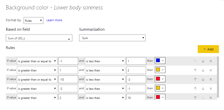

Note how above at times a score of 5 is green when working off actual values can be a concern when using z-scores, similarly a 1 which is red for actual scores is orange for z-scores. Z-scores can help indicate trends within the data when used in a rolling manner.
Single Athlete
Rather than look to build a new sheet from the start here, if we right click on the name of the first page and select duplicate page, we need only replace the data filter with a name filter to have a page for a single athlete.


For the new page, we can make the filter a dropbox rather than list by selecting the arrow in the top right, this will save space and let us include a graph with the additional space.
For now we will keep it simple and use a basic line chart to plot a few variables. First select line chart from the visualisations field.

Data we want to include in the chart can be added through the values or axis sections. In this case, date will be our axis and z-scores will form the values. As there’s a few months of data present, I have added in a data filter, to allow a range of the data to be shown.
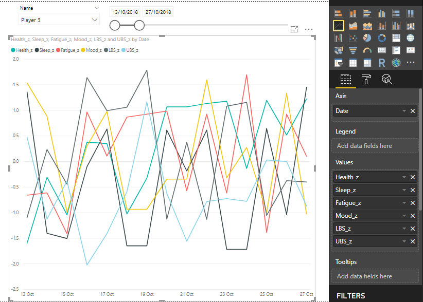

The above chart looks messy with lines everywhere, one small step we can take to affect this is to adjust the Y-axis limits. We can do this by selecting the roller brush on the right and using the Y-axis drop down. We also have the option of changing line colours here if we wish, along with many other formatting choices.
One area worth working on is how easy it is to interpret the data within the graph, while you have the option of viewing it as you mouse over, it’s worth playing around to improve this area. For my plot I performed the following:
- Increased Y-axis limits to -3.5 to 3.5 (dependant on your data)
- Added colour coded reference lines (using shapes) for -2, -1, 1, 2 to easily see when athletes when past those thresholds.
- Changed the plot background
- Changed the line colour and grouped certain variables together by colour

Now we are in a position where we can collect, store, analyse and visualise our data in an automated (and free) manner. The next step would be to publish PowerBI to the web to create a private gallery that others in your organisation can access and view. Samples from different areas are available here. There are lots of add-ins to PowerBI available here also to help with your work.
In the next blog we will look at how we can use R within PowerBI to create visuals.
PS – I realise what has been covered in this blog may seem time consuming and difficult to implement however once up and running it can save a large amount of the time that might be spent copying/pasting or changing pivot tables etc. in Excel or otherwise. As mentioned before, much of what is covered within this blog demands a bit more work initially to save time in the long run and hopefully allow you spend more time using your data effectively.

If you are looking for a similar tool that can run on Mac and Windows. MicroStrategy Desktop (Free) runs on both and also support R.
It also has a host of other features. So its a great alternative for people who own a mac and do not want to run a virtual machine in parallels just for this function.
LikeLike
Thank you! Sounds great, haven’t come across that system previously
LikeLike