
For people familiar with creating load monitoring templates in MS Excel, the use of battery charts may be a frequent go to for a visual representation of a current load compared to another value. This may be a daily value compared to historical maximum value or similar for a current weekly value compared to the previous week or maximum weekly value.
This can be a useful way of creating a quick reference visual that is easy to interpret which can be useful if it is being shown to people who may not have the same knowledge of the numbers and simply want to know if there is anything they need to be aware of.
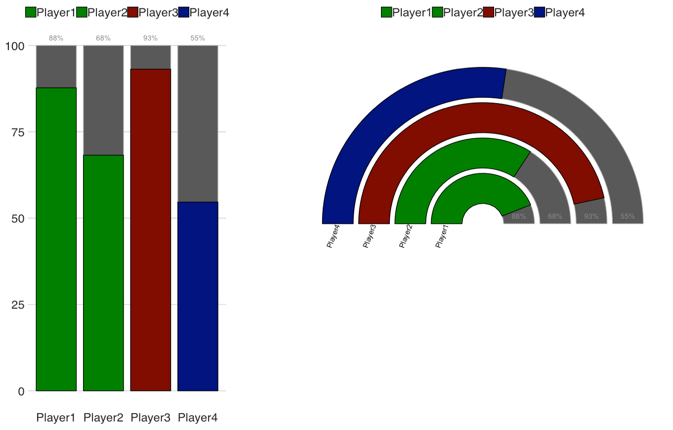
Battery Chart
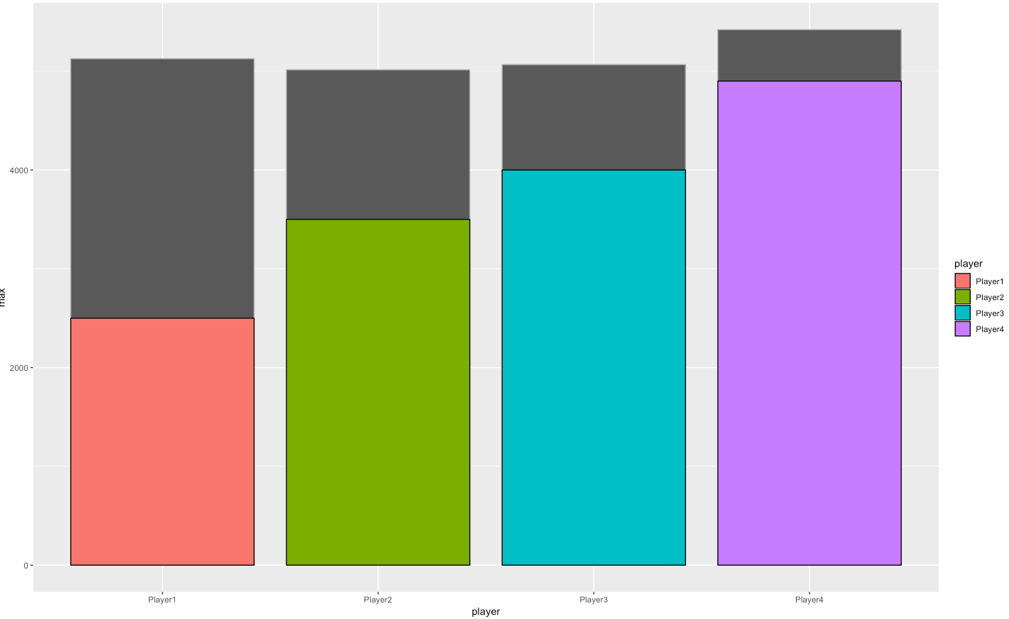
We are going to build this chart by slowly manipulating and adding layers to a basic bar chart but first we have to find some data to play with. In this case I’m going to make up some data quickly so it fits in with the chart later on. We will need a grouping variable, player, a metric of some description which we will call value and then a third variable which represents a maximum value. This can be quickly created as shown below using dplyr::tibble()
Using this data alone we could create a bar chart by layering the value on top of the max variable however this doesn’t look the best as each column is slightly different to one another. Obviously we could spend some time formatting the plot and make it nicer but I feel there’s a better alternative.
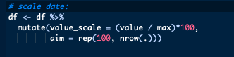
Let’s go back to our data frame and carry out some quick manipulation. First let’s scale our data to remove the imbalance between players by creating a variable which shows the percentage of the max that the current value is and add in a column which is simply 100 repeated throughout the dataframe. Now we can look to recreate our above plot subbing in our newly created values.
This a nice place to point out that the order you add layers to a ggplot object matters. If I add the percentage variable and then 100, I will only see the 100 bars as they will cover the percentage bars. As such, the 100 bars must be added first and then the percentage bars.
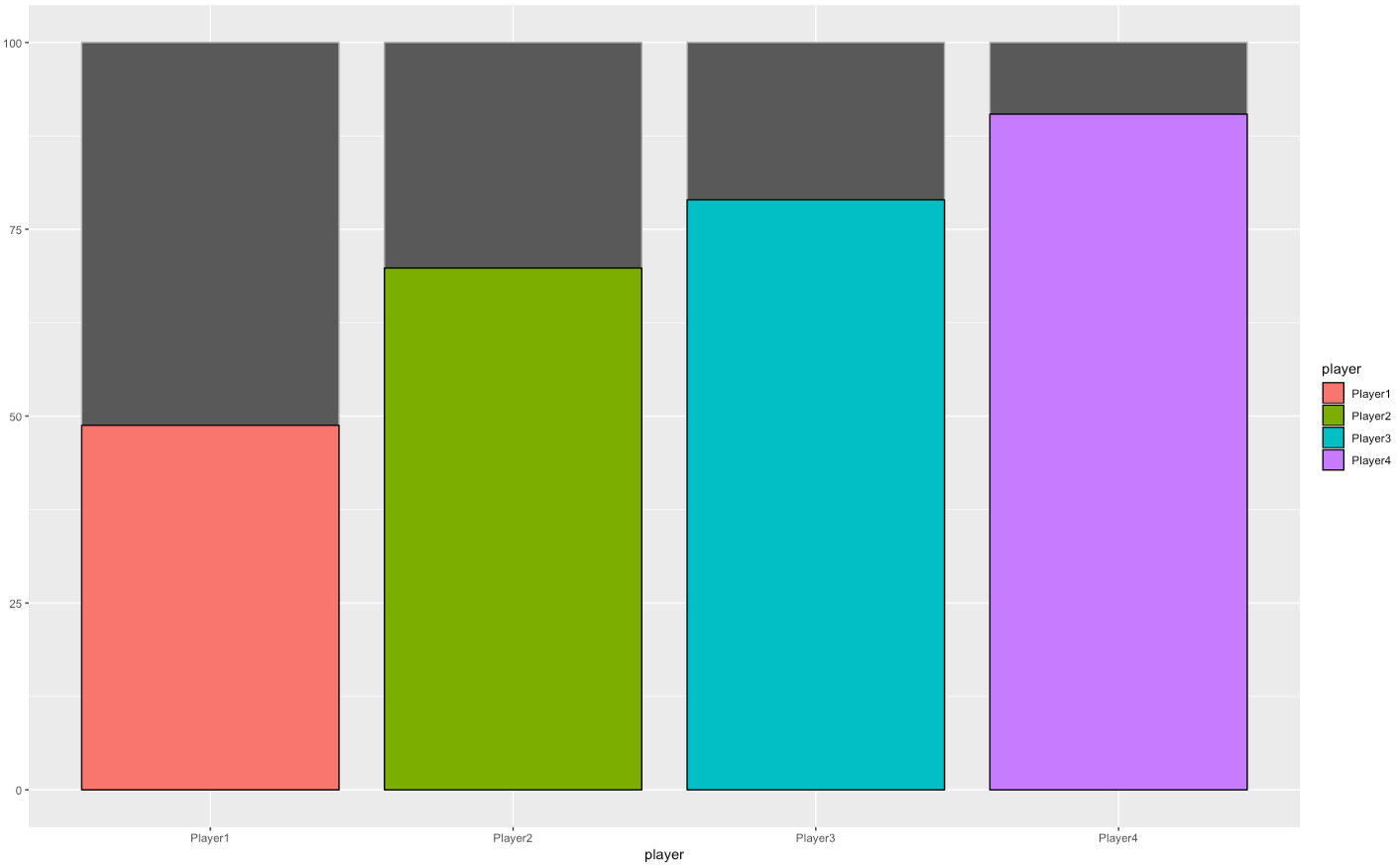
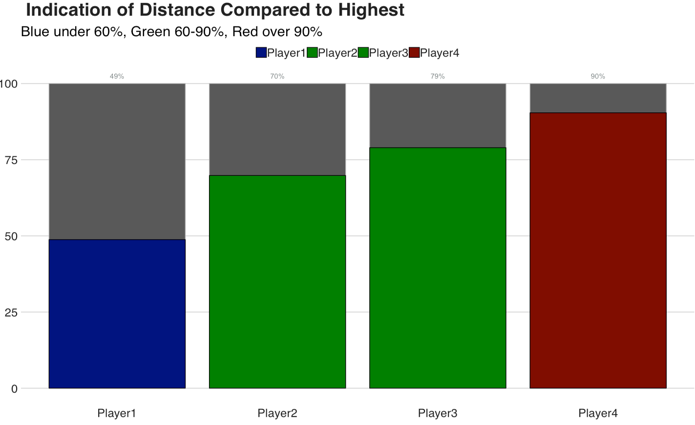
It’s an improvement as each player is now more comparable to each other. However in order to make it a plot that inferences can be made from quickly, there are a few more steps we can take. A simple one would be to add some labels to the data which we can do with geom_textand a title through labs. Within geom_textI use paste0 to add “%” to the value to show it is a percentage.

Now it might be worth looking at traffic lighting the bars to indicate where someones load is. While we could manually change the colours each time we create the graph, a better way would be to use an ifelsestatement to perform this automatically. This can be added to the scale_fill_manual function within ggplot. We have two options about how we would like to add the ifelse statement, where it can be added directly or by creating a separate function and inputting the function then.
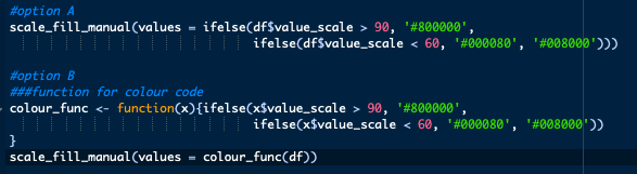
My preference is for option B as it means if I go to change the colours within the plot or add another level to the ifelse statement, I can do this without fear of altering a different layer of the plot by mistake. Note the use of RGB hex numbers for colours as well.
Now that we have added a colour code to the plot, we can add a subtitle to indicate what the colours mean and then we can quickly infer an estimate of where an individuals load fell.

We have the majority of the chart finished here with only some minor tweaks to be added:
- X and Y axis labels do not serve a major purpose here so we can remove them.
- We could spend a while customising the plot using an in-built theme or manipulating it ourselves. My preference here is to use the package put together by the BBC’s data team and the
bbc_style()function.
Which means we end up here:

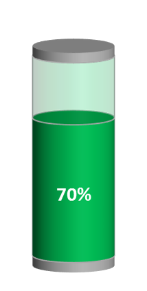
Gauge Charts
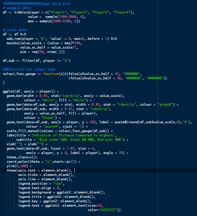
An alternative option I have been playing with is to replicate the gauge plot shown here. While the bar chart may be more useful where you might have a large number of individuals, the gauge may be more useful if you are looking at positions or comparing an individuals data across a number of weeks/cycles.
There are some differences in the approach outside of the plot itself:
- Empty row of data added to create the space at the centre of the plot by adding an additional player in this case (using
add_row). - Additional values are added equal to half the percentage along with a value equal to 50 rather than 100.
- Function for colours needs altering as coloured bars are based off the values equal to half.
- Separate dataset is created which does not include the additional player.
coord_polar(theta ='y', start= pi/2)is used to give it the circular effect.ylim(0,100)used to set y-axis which keeps shape semi-circular.geom_textused to add player names back into plot.- Additional tweaks to the theme are used to tidy the plot.
- Legend position.
- Axis elements all removed.
theme_classic()used for majority of styling.- Note: wrapping all the theme alterations into a function would be best here.
If you are looking to replicate these gauge style charts regularly looking to create functions to group steps together may be the best path.
Hopefully I’ve given you some ideas how to represent load when compared to another value here, any ideas how to improve or different methods of representing the data feel free to suggest here or on twitter!
The script for both plots above is available here.
