

An area that is starting to be investigated more and more is how we can draw links between physical demands of a sport and tactical demands. By doing this we not only allow for more in-depth understanding of the sport but we can also start to show the connection between the physical and technical sides of preparation.
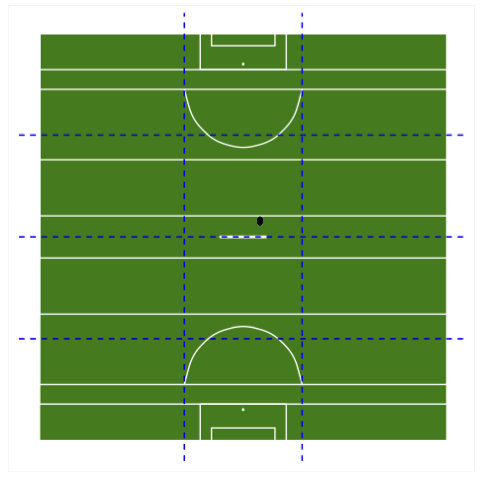
A common step in tactical preparation for team sports is to divide a pitch into different segments and use these segments to provide guidance for where players should be during different phases of a game. The images below are variations of this for different sports, these were created using ggplot2 and the script for them is available here.
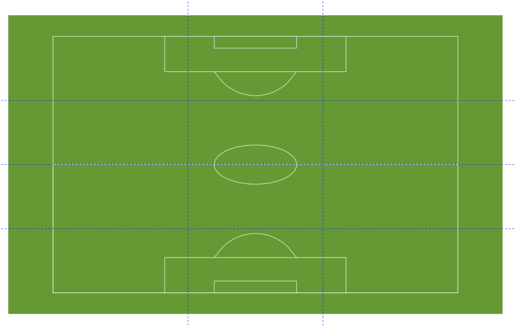
Soccer Pitch 
Rugby Pitch 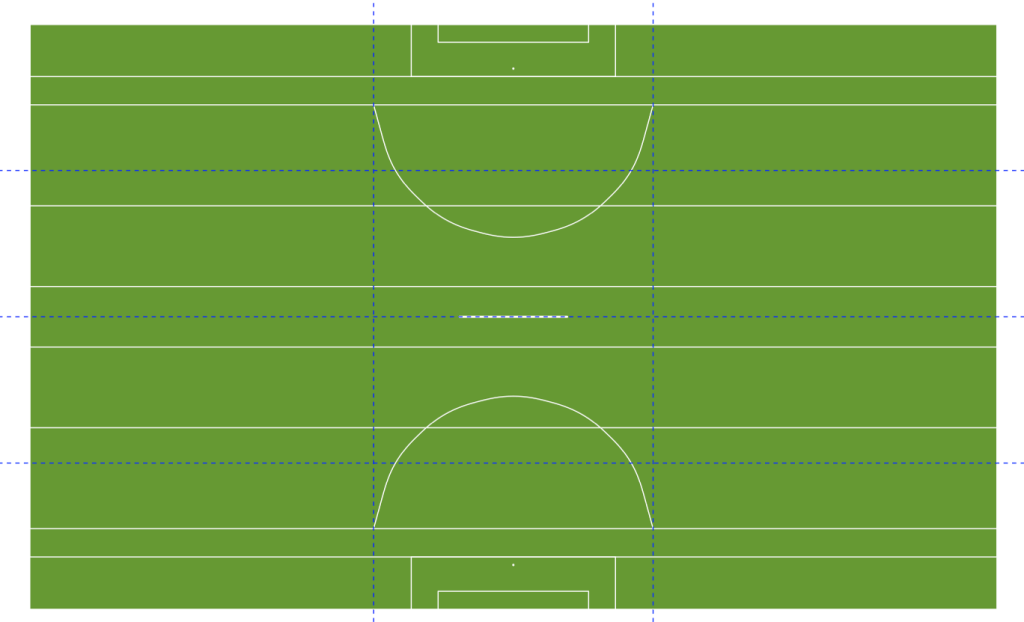
GAA Pitch
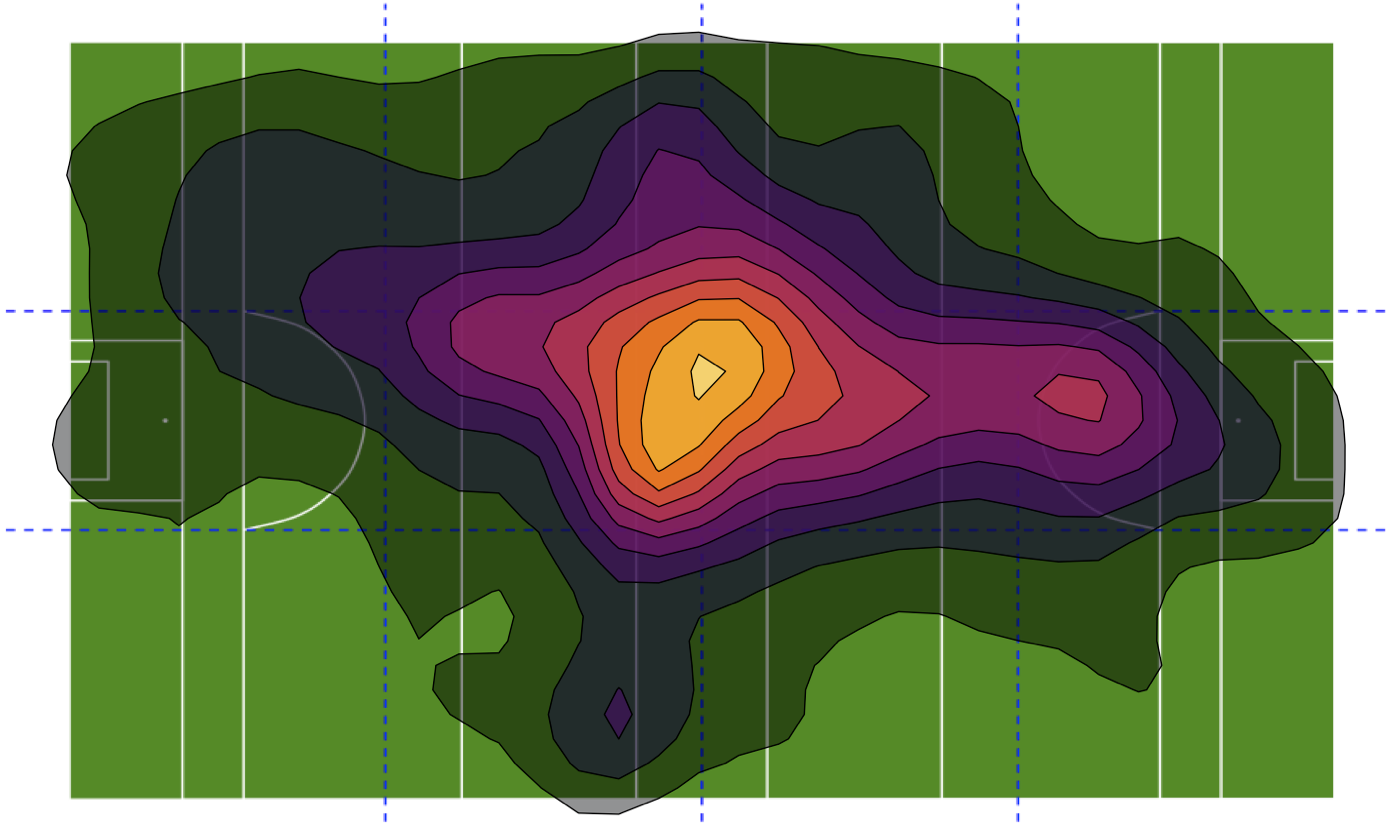
A simple way of creating a link between the tactical and physical data is to look at the time spent in each segment, depending on a player’s position there may be expectancy of a greater proportion time spent in different segments. We can look at creating a visual representation of this by using the longitude and latitude data from GPS and creating a density plot from it. This involves a number of steps with the first being to create an image of the pitch of your given sport.
Create Pitch Image
This can be largely achieved through ggplot alone with the geom_rect function. This allows us to draw a series of rectangles when combined draw the outline of a pitch.
Above shows the script for a soccer pitch which is seven rectangles combined to create the majority of the lines for a pitch. We then use geom_curveto draw the D at the edge of each 18-yard box and finally ggforce::geom_circle for the circle at the halfway. For each rectangle we use the same green colour with the hex code #669933 to create the green fill on the pitch along with #FFFFFFto have white lines.
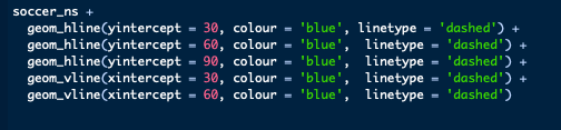
We use a combination of geom_vline and geom_hline to draw the lines to create segments on our pitches. Here we set the colour to blue and use a dashed line to signify they are different from the lines on the pitch itself.
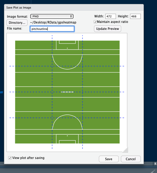
One last step is to save the created image as a .png file which we will bring back into R later on. To do this:
Select Export
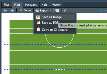
Then choosing the correct file path and filename, save the image.
Data Manipulation
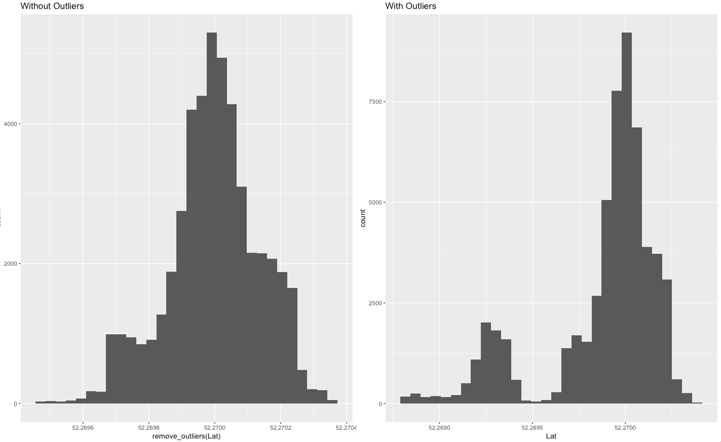
Once we have created our pitch page, the next step is to format our data to ensure the resulting heat map is accurate. This involves removing any erroneous readings from our long/lat data. While removing outlier data is generally not recommended, in this instance I feel it is the best option as otherwise we are looking to estimate data through various methods. If we look to estimate the data we may end up with a heat map that is not truly representative of the players movement.
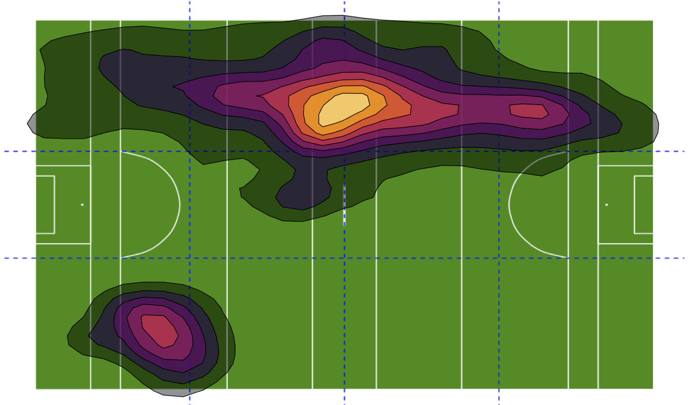
Below is an image of the data without outliers removed, where we can see it appears there are readings away from pitch, perhaps the changing rooms/warm-up area were a distance away or it was a stadium where GPS signal isn’t the best. There is also a degree of individual assessment involved here, for example given the position this player plays, he would not have a profile that quite clearly favours a single side of the pitch.
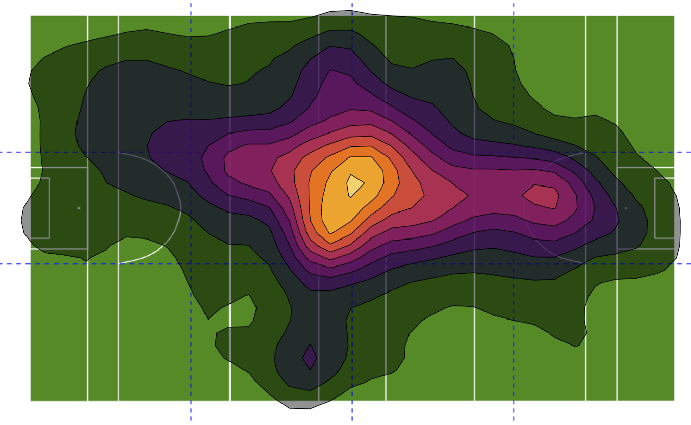
Once we remove outliers, we get a much better image
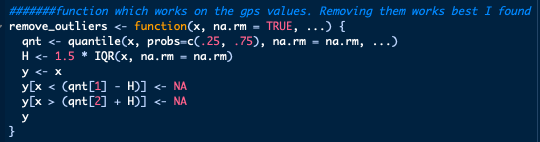
The function that removes outlier data works by finding the quartiles in your data, calculating the inter-quartile range and then using these values to determine and remove outlier data. However rather than use this on the data and alter it, instead we will use this function inside ggplot later on.
Here we can see the difference removing outliers has on the data through histograms.
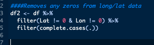
Depending on the GPS system in use, you may get zero values, NA values or a combination of them while the system is connecting to satellites at the beginning of the session or if the unit loses connectivity during the session. We can quickly filter the data to remove these values.
Create Heatmap

We have one small step left before we can start building our heat map, we must bring the image of the pitch created earlier back into R using png::readPNG
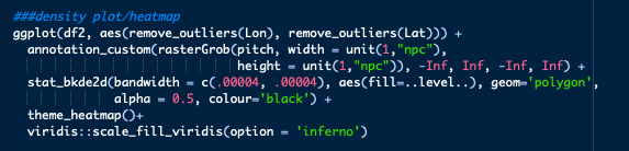
Finally we can create our heat map.
Lets break the above script down line by line:
ggplot(df2, aes(remove_outliers(Lon), remove_outliers(Lat)))- Standard initial ggplot line with the addition of our
remove_outliersfunction created earlier.
- Standard initial ggplot line with the addition of our
annotation_custom(rasterGrob(pitch, width = unit(1,"npc"), height = unit(1,"npc")), -Inf, Inf, -Inf, Inf)- Bringing our pitch image into ggplot using a combination of
ggplot2::annotation_customandgrid::rasterGrob
- Bringing our pitch image into ggplot using a combination of
stat_bkde2d(bandwidth = c(.00004, .00004), aes(fill=..level..), geom='polygon', alpha = 0.5, colour='black')- Here we create our heat map. Technically, we are creating a 2D kernel density estimate. While there are functions available in ggplot2 to build 2d KDEs, I was not able to create it with the look I was aiming for which is why I went with
ggalt::stat_bkde2dinstead. - The
bandwidthcall sets the smoothing between data points. As we are looking at very minor changes in long/lat, these are set very low for our data. alphasets the transparency of the heat map, I have set low to allow for the lines underneath to viewed easier.coloursets the outline of the contours to be black.- The
..level..in the aesthetics references a dataset ggplot creates in the background
- Here we create our heat map. Technically, we are creating a 2D kernel density estimate. While there are functions available in ggplot2 to build 2d KDEs, I was not able to create it with the look I was aiming for which is why I went with
theme_heatmap()- Basic ggplot theme settings, here I remove axis lines, text ticks along any legends
axis.title.x=element_blank(), axis.text.x=element_blank(), axis.text.y=element_blank(), axis.title.y=element_blank(), axis.ticks.y=element_blank(), axis.ticks.x=element_blank(), legend.position="none")
- Basic ggplot theme settings, here I remove axis lines, text ticks along any legends
viridis::scale_fill_viridis(option = 'inferno')- Finally we set the fill colours for the contours in our heat map.
- I did have some issues setting this as not all ggplot fill approaches seemed to work.
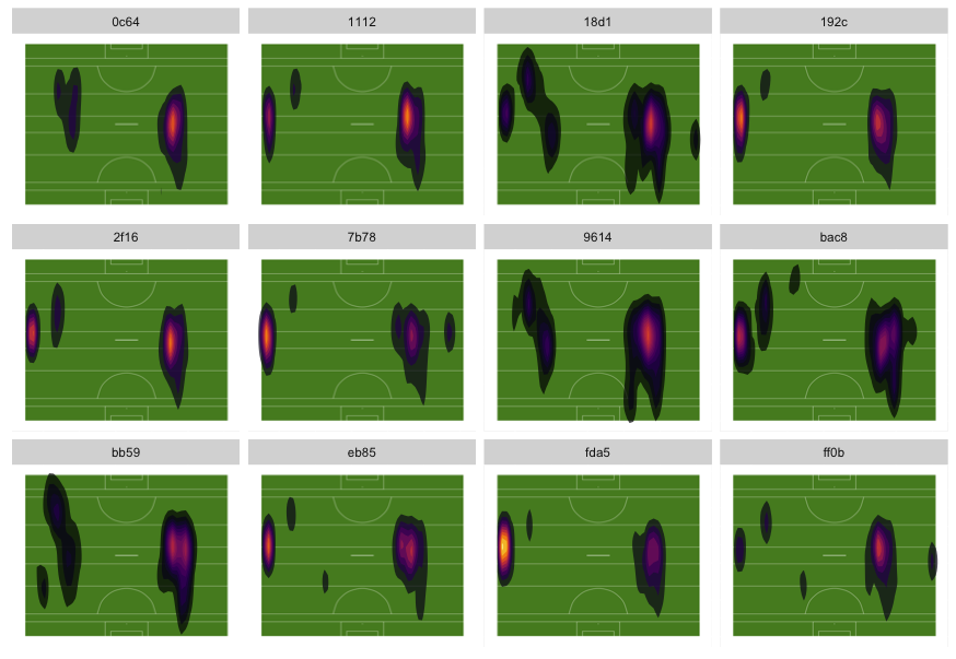
This approach can be facetted to create a grid of plots outlining heat maps for each individual.
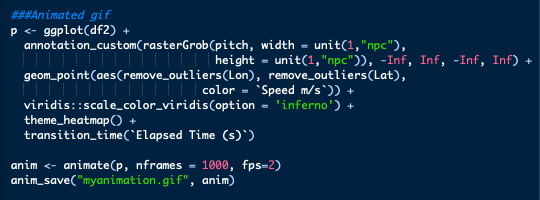
As an added bonus, we can also create a speed trace of sorts using gganimate. There are some slight differences to the plot where we use geom_point to create a point for every long/lat point, colour based on velocity and then use time to animate it. Initially this creates a very rushed image which is not much use however by using gganimate::animate we can slow this down then save as a .gif file using gganimate::anime_save which leaves us with the below.
It’s also worth mentioning that it is possible to create the heat maps in PowerBI through R which allows for them to be shared throughout your organisation.
All scripts used for this blog are available here.
