How to Create Interactive Reports in R Markdown Part II: Data Visualisation

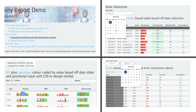
In our last post we looked at how we can use R Markdown to produce tables of data ending in this report. This included grouping data, conditional formatting along with adding design features to improve the overall athletics and usability of the table. Now we will cover another method of showing data within R Markdown: … Continue reading How to Create Interactive Reports in R Markdown Part II: Data Visualisation

Advertisement

How To Create Interactive Reports In R Markdown Part III: Reactive Elements

Having put together the main body of our report over the last two posts, now we are going add elements which will add considerable value for the end-user. Firstly, we will look at how to give the end-user the ability to filter and interrogate the data through additional Shiny reactive elements. After which we will … Continue reading How To Create Interactive Reports In R Markdown Part III: Reactive Elements

How To Create Reports In R Markdown IV: Shiny App Calendar Heatmap

In our R Markdown series to date, we have covered initial report design looking at tables of data along with data visualisation. We followed that up by adding shiny reactive elements to our report along with CSS to design the aesthetics. Now we are going to combine many of those elements and look at how … Continue reading How To Create Reports In R Markdown IV: Shiny App Calendar Heatmap

Principal Component Analysis and Visualisation of Training Load Data

Recently Dan Weaving and the research group at Leeds Beckett University put out a paper outlining how to perform a type of dimension reduction on training load data: principal component analysis (PCA). The benefit of such an analysis is it can reduce a large number of metrics into a more manageable dataset. This may uncover … Continue reading Principal Component Analysis and Visualisation of Training Load Data

How to Report Your Data With Google Data Studio: An Intro

To date we covered a number of methods of reporting data including Excel, PDFs through RMarkdown and more interactive platforms such as PowerBI, RMarkdown (I, II, III) and Shiny. Here we will add to this list and look at a relative newcomer to the scene in Google's Data Studio. Data Studio came onto the scene … Continue reading How to Report Your Data With Google Data Studio: An Intro

How to Overcome Messy Excel Sheets in R

**Largely Inspired by many a painful Excel sheet along with Duncan Garmonsways (@nacnudus) Spreadsheet Munging Strategies & recent linked presentation When you first open *THAT* spreadsheet..... It's not unusual as a practitioner to be in the position where you get landed an Excel sheet or a number of them often organised in unusually formatted tables … Continue reading How to Overcome Messy Excel Sheets in R