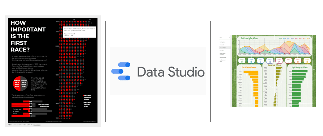
To date we covered a number of methods of reporting data including Excel, PDFs through RMarkdown and more interactive platforms such as PowerBI, RMarkdown (I, II, III) and Shiny. Here we will add to this list and look at a relative newcomer to the scene in Google’s Data Studio. Data Studio came onto the scene in 2017 with limited functionality initially. However over time, as various components have been added, it has become a very viable option for reporting on and sharing reports of data. A gallery of reports created using DataStudio can be viewed here.
Why?
Before getting into the nuts and bolts of Data Studio, I want to quickly outline reasons why it may be worth looking into using Data Studio for your reporting.
- It’s free
- While for some this may not be a meaningful consideration, for many the ability to freely share interactive web-based reports throughout an organisation remains hidden behind a paywall.
- Web-based reporting
- Think green! Reduce the need for paper reports.
- Easily shared with many people.
- As mentioned above the interactive features of Data Studio can help engage users above and beyond the ability in non-interactive reporting.
- Easily integrates within other Google based systems (Drive, Sheets, Forms etc.)
- Googledrive package in R combined with Google Sheets allows for near complete automation of reporting updating.
- Includes additional information option surrounding GDPR
Data Studio
While it does have some odd quirks in how it works, with a bit of creativity and data structuring, it is possible to fully automate your analysis and reporting. Here I will cover some of the basics around loading data, creating a basic report and sharing it. Then in the next post we will cover how we can use R to manipulate and send our data to Googlesheets before DataStudio (DS) pulls that data in to build the report.

Before we go into the various elements of DS, I want to provide a minor glossary of terms first. DS uses a number of terms that are slightly different to other platforms and may cause a degree of confusion initially.
- Data Source
- A source of data that can be added to your report.
- Connector
- A connector is a method of importing data from outside of DS.
- Reports
- A dashboard style report that can have multiple data sources, pages and visuals.
- Explorer
- A dashboard for exploring a single data source or metric within a data source.
- Dimensions
- A categorical variable that can be used to define different levels within the data.
- Blended Data
- Method of combining datasets similar to joining as part of a query in Excel or joins in R/Python/SQL.
- Data Schema
- Overall layout of your data i.e. number of columns, columns headers, types of data.
- Plays a more important role in DS than other platforms.
Loading Data (Connectors)
We have multiple options when it comes to loading data into DS. Including but certainly not limited to:
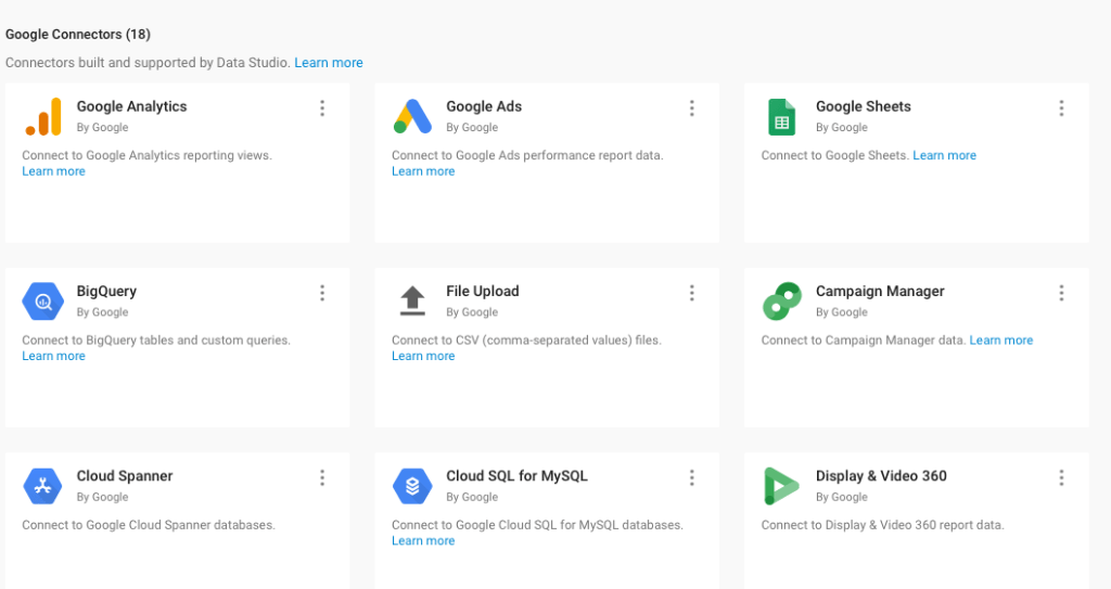
- File Upload
- AdWords
- Cloud SQL
- Google Cloud Storage/Analytics/Sheets
- MySQL
- PostgreSQL
- Search Console
- YouTube Analytics
Here we will look at two methods people are most likely to require from sporting environment perspective: File Upload and Google Sheets. Depending on your needs, it may be worth looking into how to create an API to a separate platform however that won’t be covered here as its not something I have done (if anyone has built an API for a Sports related platform they would like to either share or go through the development of I am happy to add it).
File Upload
Uploading a CSV file to DS is probably the most straightforward method. It simply involves selecting the desired file and uploading. However once uploaded it is worth ensuring that the correct variable type has been assigned to each of the columns within your data set. While DS generally does assign the correct type, at times if there is a high amount of missing data, it can be incorrect.
A minor downfall with this approach is that it does require daily/regular interaction with DS in order to update your report with new data. Similarly, the data upload must always be in the same schema as the previous ones.
Google Sheets
The second method we will cover here is connecting a google sheet to DS. As the updating of a google sheet can be automated through various methods this would be the approach I would look to use if constructing a report that will be used on a regular basis. There a number of options through which the GS can be connecting including:
- Select sheet from drive
- Insert URL
- Insert sheet ID*
*The sheet ID can be isolated from the sheet url by extracting the part of the URL following “/d/” which seems like a random alpha-numeric piece i.e: https://docs.google.com/spreadsheets/d/123aBCdef4Ghi4jKL5Mn60pQR_s7tuvWxYzABc891Abc/edit#gid=0
Report Building
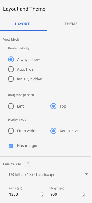
When it comes to constructing your DS report there a few options available to us around the outline of the report.
- Sheet Dimensions
- Overall height & width of the report
- Can set report to auto-size according to screen width which may be useful if report will be often viewed on mobile phones
- Theme
- Sets overall aesthetics of the report
- Two preset options: Simple Light & Simple Dark
- Can build custom themes as well
- Layout
- Can have margin or not
- Tab-based page selection or always present menu on left of screen
- Options including header visibility, grid dimensions and navigation tab position
Building The Report
Here we look at some of the practical steps involved in building your report through DS. It is worth exploring each of these in greater detail. While I will cover the basics here each has a number of further steps that can be taken to customise both your report and visuals.
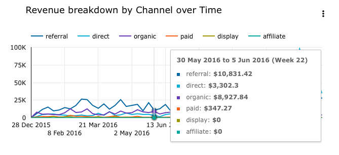
Line Charts
We have two variations of line charts available to use here. First a basic line chart and secondly, a time series line chart. Both charts simply need an a set of values for the y-axis and then either a datetime based or categorical variable for the x-axis
Scatter Plots
Scatter plots again quite straightforward to produce in DS. However their is a slight different to how other platforms work. First of all we need a “Dimension” variable and its also worth noting how DS will look to apply an aggregation (Sum, Mean, Max etc) of some sort to your data. As such, we need three metrics to produce one:
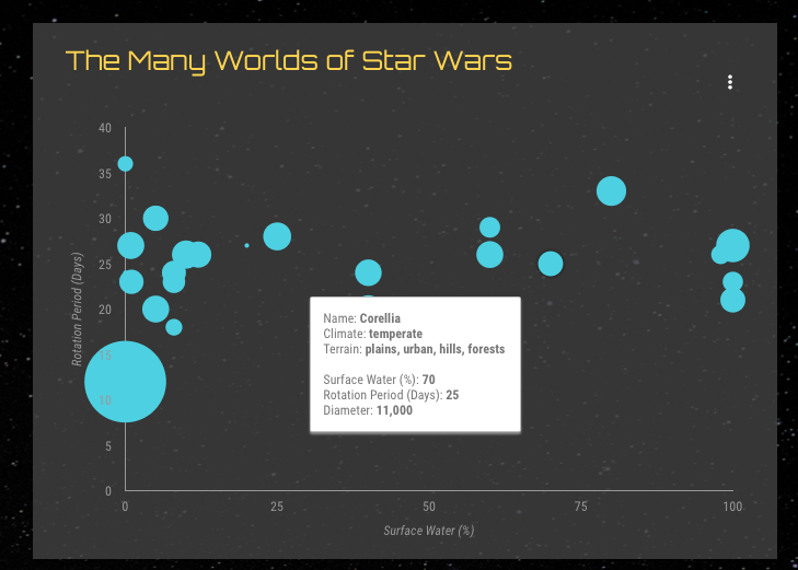
- X Metric
- For your X-axis
- Y Metric
- For your Y-axis
- Dimension
- Can be a date time metric or categorical.
- Used to identify or group data points together for your plot
However there are some steps worth keeping in mind when building your visual here. DS places an initial limit of 1000 points for your plot, which can be easily changed through plot settings. Even if your data contains negative values, the axis limits will start at zero. These can be fixed or set to automatically update.
Cards
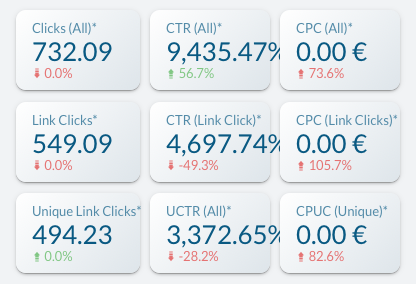
Cards let you highlight a single value within your data and depending on the data how it compares to a different value. However at times people may want to display a set of smart data within a report (Min, Max, Avg etc.) this may be better achieved through the use of tables and calculated values.
Community Visualisations
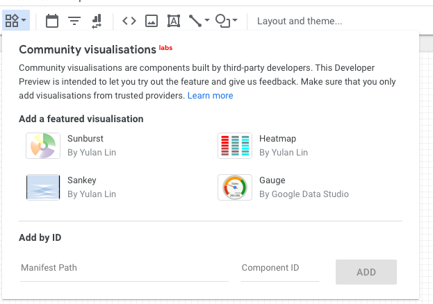
The base selection of charts offered by DS, though extensive, does not include a number of frequently used charts such as gauges, sankey and heatmaps. However, DS offers the option to include community built visualisations. Finding these these visualisations is not always the most straight forward. A small number can be viewed from the report builder screen, in general, it does involve either finding a report that includes them or the code to build the visualisation on GitHub.
Tables
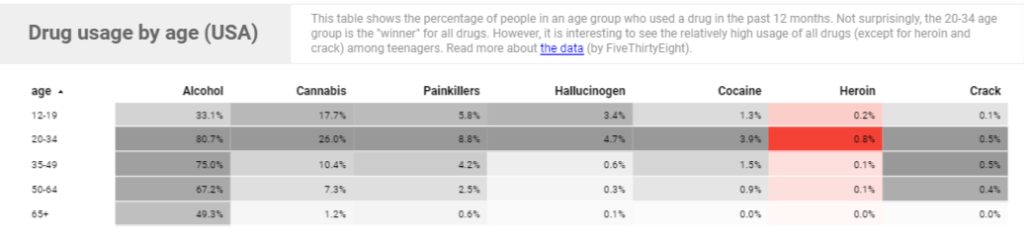
Although we only have one method of incorporating a table into our report here we do have a number of methods available to customise this report including:
- Conditioning Formatting
- Linking Images
- Colour Shading
- Column Editing
Filters
There are two main filtering methods within DS:
- Page/Report Filters
- Data Filters
Page/Report Filters
These filters filters can be added to your DS to allow the user apply filters to the visuals within. These filters can be selected to work within the page they are on only or across multiple pages.
If you only wish filters to apply to certain visuals on a page, the filter along with the desired visuals can be grouped together to have this effect. These filters also include date range calendar based filters.
If there are multiple data sets present in your DS which you wish to have a single filter work across. The different datasets must have the same schema. By this it means they must have the same column headers in the same order as well. This can be achieved by adding empty columns if they are missing from certain datasets.
Data Filters
Filters can be applied to the data that is being fed into the report. If you have multiple teams data and you want to build a report for one only, this can be managed through the data filters for the visual. Such filters allow you utilise basic functions in order to build filters to use for your visuals.
Calculated Values
Columns
While not as extensive as DAX, R etc. allows, DS does have functions available to manipulate your data and create new metrics. These can be applied across the dataset as a whole which may result in a new column for example or within the visual itself to alter the data. The functions allow for manipulation of numerical, text, geographic and datetime based data. However, if you are looking to create metrics which may be considered complex, it may be easier to create these outside of DS first. The full list of available functions can be viewed here.

Additional Tips For Data Studio
Building
- Use the template gallery for ideas about constructing your report.
- Have multiple pages to prevent a single but cramped page.
- Changing between visual/plot types is easily achieved and helps decide the best approach.
- Features within a single page can be made appear across all pages by right-clicking and selecting make report level.
- A useful step when adding a header/footer image/logo for your report .
- Copying reports from an original or template is easily achieved with the option to replace data sources given.
- There is the option of including images within tables in DS, although it does involve a bit more work on your part.
- Column headers can be tidied through the data source rather than finalising them prior to data import. This ensures your data headers look clean and tidy in your final report.
- Items can be moved around the report using the arrow keys on your keyboard. Similarly, multiple can be moved by grouping together and moving.
- Google has a number of videos to help get started in DS here and it details any updates in release notes.
Report Sharing/Using
- Reports can be shared in a number of ways:
- Publicly – allowing anyone view it.
- Private – Authorised people can view (with read and/or write only options).
- Link Access – People with the link can view it.
- Anyone if publicly available.
- Authorised viewers if private.
- Certain items can embedded into your report using the URL embed option.
- Similarly your report can be embedded on a different website.
- Data can be set to refresh at regular intervals with the default being 15 minutes.
- Report emails can be scheduled to automate informing people about report updates.
- Each visual allows the user to explore the data themselves through the explorer option in the top right corner.
- Each report can be used with google analytics to record information about report users.
Hopefully that helps get you started in Google Data Studio, next time we will look at some hands-on report building!
