
In our last post we looked at how we can use R Markdown to produce tables of data ending in this report. This included grouping data, conditional formatting along with adding design features to improve the overall athletics and usability of the table. Now we will cover another method of showing data within R Markdown: data visualisation. We previously looked at how ggplot2 can offer a lot when it comes to visuals and here we will look at a number of new packages alongside it:
- ggplot2
- ggiraph
- plotly
- dygraphs
- Although not package based, we will also cover how to produce calendar heatmaps
We will use the same the dataset as before (available here) and cover how to produce this report.
ggplot2
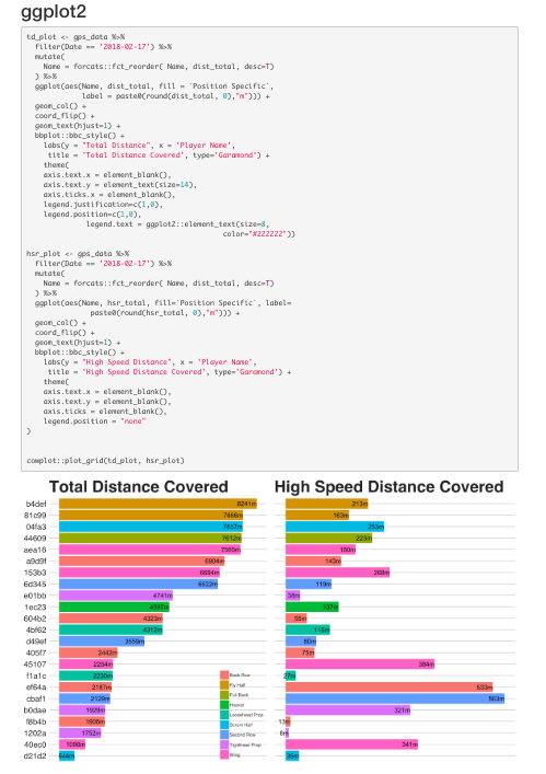
Before moving onto the interactive visuals, I want to go through some additional steps we can take with the ggplot2 package in order to enhance graphs. Here we will create a graph that can be used to plot daily or weekly loads arranged from highest to lowest, along with colour for position. We will reproduce this for both total and high speed distance, then join them using the cowplot package
Total Distance
Having loaded our data and filtered for a date or week in particular, we have one small step to take before we start to build our graph. Using forcats::fct_reorder()we can select a factor or character variable and reorder according to another. In this case we are going to reorder the Name by the dist_total variable using dplyr::mutate():
mutate(Name = forcats::fct_reorder( Name, dist_total, desc=T))
Having reordered our data set we can start to build our graph.
ggplot(aes(Name, dist_total, fill =Position Specific, label = paste0(round(dist_total, 0),"m")))- Here we set
Nameas our x-variable;dist_totalas our y-variable; thefillaesthetic is to position - We create a label using
paste0()which will show the distance value rounded to zero decimals with amto show it’s in meters.
- Here we set
geom_col()- This function is a quick way of saying
geom_bar(stat='identity')which produces a bar graph with the bars set to the actual value.
- This function is a quick way of saying
coord_flip()- Flips the x and y axis
- Note when referring to the horizontal axis after this function it must be referred to as the y-axis.
- Similarly, the vertical is now the x-axis
- Flips the x and y axis
geom_text(hjust=1)- Applies the label we created earlier
hjust=1shifts the value slightly to the left as I wanted it to appear inside the bar. This prevents it getting cut off if the value is high.
bbplot::bbc_style()- Applies the theme settings from the bbplot package
labs(y = "Total Distance", x = 'Player Name', title = 'Total Distance Covered', type='Garamond')- Sets the axis labels, graph title and font type used
theme(axis.text.x = element_blank(), axis.text.y = element_text(size=14), axis.ticks.x = element_blank(), legend.justification=c(1,0), legend.position=c(1,0), legend.text = element_text(size=8, color="#222222"))- Sets the axis text size, legend position and legend text size
- I have the legend positioned in the bottom right corner as it corresponds to the lowest distance value. Therefore it won’t overlap with the graph at any stage
The above creates the ordered bar graph for total distance, next we will create it for high speed distance. There are a few small tweaks needed for this graph which I will outline.
High Speed Distance
Although we are graphing high speed distance, we want the graph ordered by total distance. This means the data for distance and high speed distance will be for the same player as someone looks across the graph. This allows for a quick review of total distance along with how much was covered at high speed.
- y-variable and label will be mapped to
hsr_total theme(axis.text.x = element_blank(), axis.text.y = element_blank(), axis.ticks = element_blank(), legend.position = "none" )- Both axis labels are removed as it looks crowded with them included.
- Legend is removed it will cramp or overlap the graph to include plus the first legend is the same.
Having created and named our two plots, we can now look to join them using the cowplot package.
Cowplot
We have two main options when it comes to join ggplot graphs together, cowplot and patchwork. Purely out of familiarity, I tend to use cowplot more although patchwork seems to work just as well.
For this example we will use the cowplot::plot_grid()function which quickly joins our two graph.
cowplot::plot_grid(td_plot, hsr_plot)
Having looked at how we can produce the above graphs, next we will cover two methods which show how we can replicate them along with enhance them using interactive data visualisations.
Interactive Data Visualisation
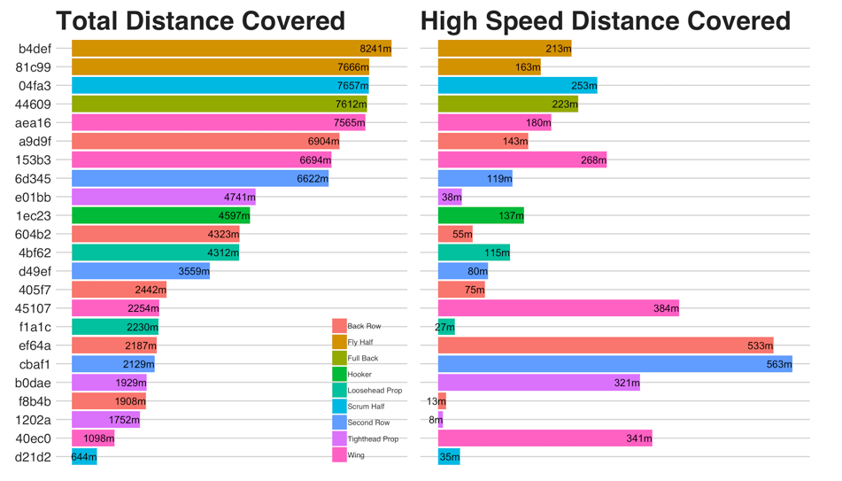
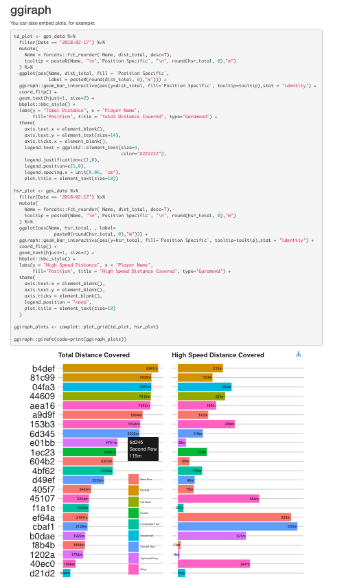
ggiraph
ggiraph is the first package we will look at in order to create our interactive visuals. This package allows you create interactive layers within a ggplot object. There are lots of different layers you can include, plus even more with the ggiraphExtra package. For the graph we created above, we want to make the bars in our plots interactive.
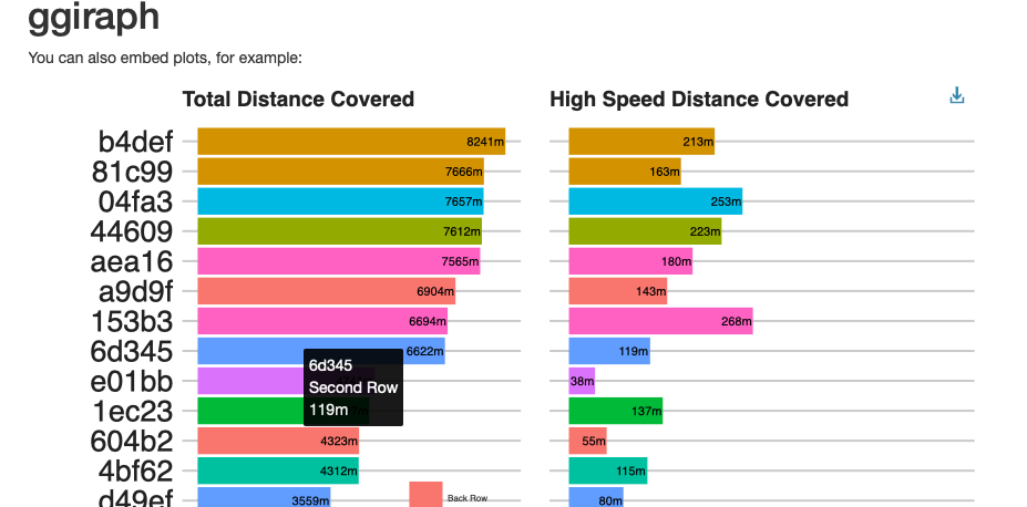
To do this we have a few changes and additions to our script above. Before we start to create the graph, we can add a column to our dataset which will be what we want to show when we hover over a bar on the graph. The section that appears when we hover over is known as a tooltip, therefore I am going to add a column called tooltip.
tooltip = paste0(Name, "\n",`Position Specific`, "\n", round(dist_total, 0),"m")- Creates tooltip with name, position and total distance value showing.
- \n is a regular expression which adds a line break.
Next we must add our interactive graph layer:
ggiraph::geom_bar_interactive(aes(y=hsr_total, fill=Position Specific, tooltip=tooltip),stat = 'identity')- This replaces our
geom_col()function - We must set the aesthetics for this within the function.
- Including tooltip equal to the tooltip variable we created.
- As we have change to a
geom_bar()function,stat='identity'must be included.
- This replaces our
We then replicate these steps for our high speed distance graph.
While we can still join our plots using cowplot like before, we must print the graph using the ggiraph::girafe() function.
ggiraph_plots <- cowplot::plot_grid(td_plot, hsr_plot)- Creates plot object
ggiraph::girafe(code=print(ggiraph_plots))- Prints
ggiraphobject
- Prints
We will cover some additional steps we can take within ggiraphto enhance our data visualisation later on. Next up is a different package that allows for interactive graphs: plotly
plotly
Plotly is whole separate software for analysing and visualising data however there are packages which allow for a degree of usability within R and other languages. When it comes to using it in R, you can create graphs using the plotly package alone. Fortunately, there is also the option of making a ggplot object reactive through the plotly::ggplotly() function, which will be our chosen method here.
This involves one change to the graph itself which is removing the labs() function. Then we have a bit more work after our graph is created:
td_plot <- plotly::ggplotly(td_plot)hsr_plot <- plotly::ggplotly(hsr_plot)- Both graphs must be wrapped in the
ggplotly()in oder to become plotly objects.
- Both graphs must be wrapped in the
plotly::subplot(plotly::style(td_plot,hoverinfo=c('y+x')), plotly::style(hsr_plot, hoverinfo=c('y+x'))) %>% plotly::layout(title="Comparison of Total Distance to High Speed Running", titlefont=10, showlegend=TRUE, legend = list(font = list(size = 8)))- Here we join our graphs together.
- Using
hoverinfo()we set the tooltip to show x and y values only. - Then we set the graph title and format the legend using the
layout()function
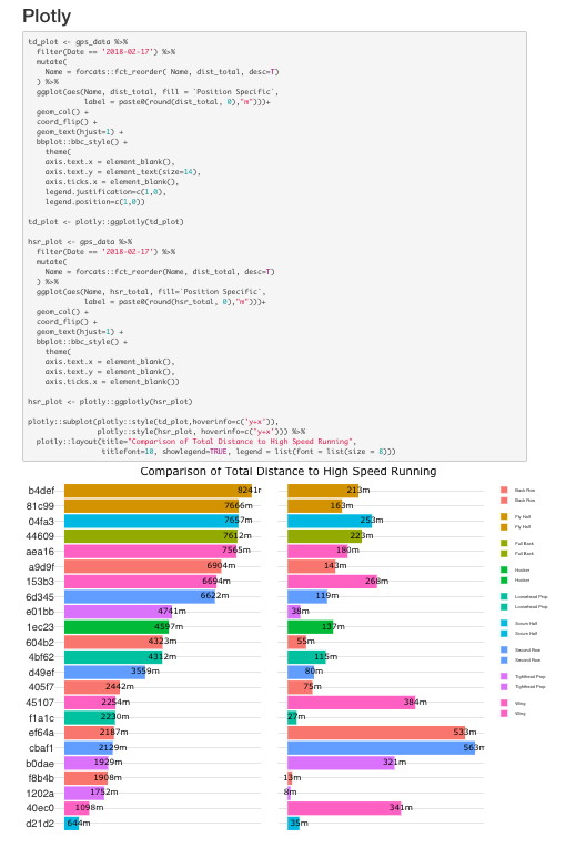
Unfortunately, I find plotlys output to be somewhat untidy. I wasn’t able to find a way to only show one of the legends which means all positions are shown twice. Plus while plotly adds a lot of interactive elements if used on a computer/laptop, these elements can make the graphs difficult to use on mobile devices. This is an important factor to take into consideration as many people may view the report through their phone or iPad. If it isn’t optimised for use on all platforms then they may fail to use it on regular basis.
Having looked at two ways of adding interactive elements to ggplot data visualisation next we will cover a different visual package: dygraph
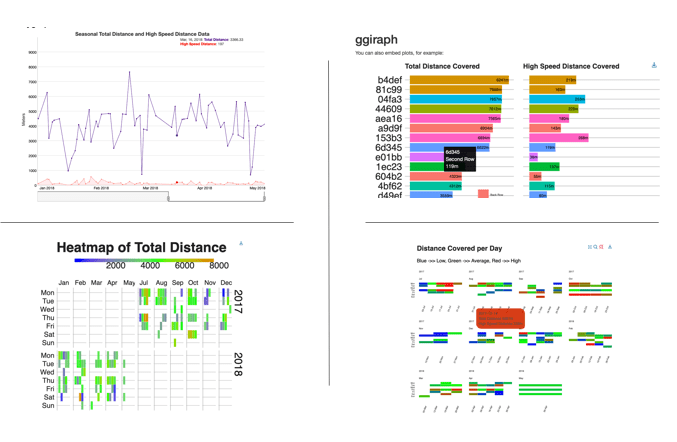
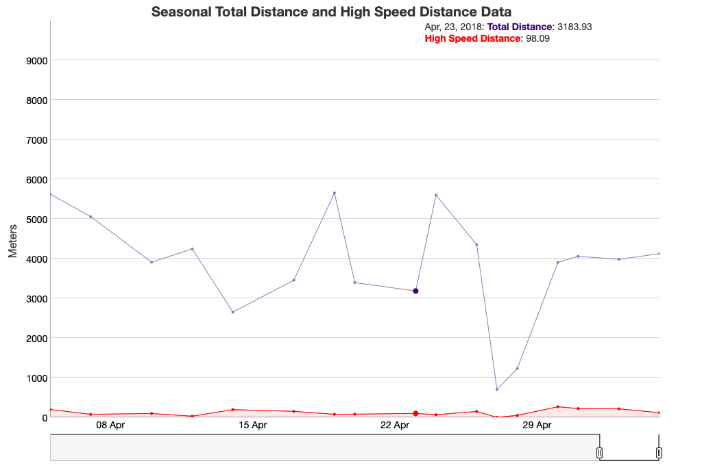
dygraphs
Dygraphs is a package designed specifically for the visualisation of time-series data. For our example we are going to feed it all the data for an individual and then start to add elements to interact with it.
Before we do this, it’s worth renaming the columns so they appear in a tidy manner in the final plot:
names <- c('Date', 'Total Distance', 'High Speed Distance')- Creates vector for column names
colnames(ts_data) <- names- renames all columns using the names vector
Next we must turn our data into a time series data set using xts::xts():
gps_ts <- xts(x = ts_data, order.by = ts_data$Date)- Here we turn our dataset into a time series, ordering it by the Date variable
Now we can start to produce our dygraph:
dygraph(gps_ts, main = 'Seasonal Total Distance and High Speed Distance Data')- Set the data and chart title
dyRangeSelector(dateWindow = c(max(ts_data$Date)-30, max(ts_data$Date)))- Add a range selector to the base of the chart
- I also set the default values to show the most recent 30 days of data using the
dateWindow()function
dyAxis("y", label = "Meters", valueRange = c(0, 10000))- Set Y axis title
- Set Y-axis min and max values
dyHighlight(highlightCircleSize = 4, highlightSeriesBackgroundAlpha = 0.5, hideOnMouseOut = TRUE)- Sets highlighted data point size
- Highlights closet time series line and fades others
- Removes data highlight if mouse leaves chart area
dyLegend(show = "follow")- Legend will move across the chart as your mouse does
dyOptions(drawPoints = TRUE, pointSize = 2)- Adds a point and a line through each data point plus sets data point size
dyAxis("x", drawGrid = FALSE)- Removes x-axis gridlines
dySeries("High Speed Distance", fillGraph = TRUE, color = "red")- Adds a fill under the high speed distance line with a red fill colour
- We have the option of creating a secondary y-axis here with the following:
dyAxis("y2", "High Speed Distance")- However I felt this made the chart harder to read.

Those are some of the options available all in relation to interactive graphs, a full list of options can viewed here. I want to finish this post with a very nice way of showing data over time through data visualisation: a calendar heat map. Along with some of the tools outlined above we can make them interactive as well.
Calendar Heatmaps
While there is a few packages that help create a calendar heat map in R, I struggled to find one that was both visually pleasing while also allowing for reactive elements. Through a lot of time on google plus adding some of the areas covered above, I found a few ways of creating them.
Github
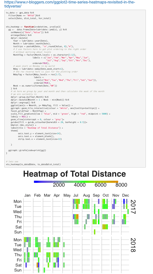
There first and probably easiest is by sourcing a function available on GitHub. Simply using the source()function we can create the calendarHeat() function and then run it to produce the below.
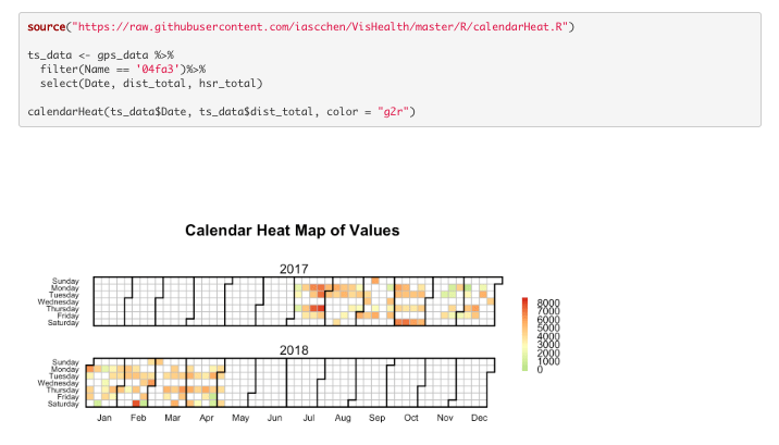
Here we have set the date column, value to map column (dist_total) and the colours to go from green for low to red for high. This is a very quick and easy way to produce a calendar heatmap. However I struggled to find a way to make this reactive so moved on.
ggplot Function
Next up we have a function I came across on the MarginTale blog. However I tweaked it to include some reactive ggiraph elements.
lubridate & ggplot
Finally we have a method I adapted from John Mackintosh. The original script is available here on GitHub. Again, I have tweaked a few bits along with including some CSS to affect the tooltip.
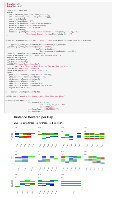
Personally, the final method would be my choice as it is visually appealing while also quickly interpretable. If there’s enough interest, I may do a separate blog to cover the various steps here. This approach can be used with any metric recorded on a regular basis, here is a sample using percentage of max velocity reached on a daily basis:
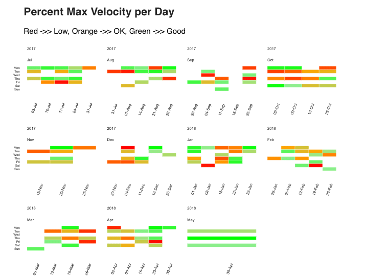
I altered the colour scale here so it worked out that any value clearly red was below 80%, orange 80%-90%, then all the green colours were 90%+.
In Closing
Hopefully I have given you a few ideas and methods around how R Markdown can be used to produce meaningful and interactive data visualisations here. If you have thoughts or comments about the above, feel free to leave a comment below or through twitter @SportSciData. Next we will look at how we can use shiny elements within our report to give the end user real ability to interrogate the data themselves.
As always, a version of the report with all code is available to view here, along with the script here. If you haven’t already, don’t forget to check out Part One of the series where we looked at ways produce tables of data with R Markdown. Thanks for reading!
Part 3 of this series is now available to read. In this post we cover how to include shiny reactive elements in your report along with some basic CSS tips!
Don’t forget to check how different reporting elements can be combined through a Shiny App as well!
