
Having put together the main body of our report over the last two posts, now we are going add elements which will add considerable value for the end-user. Firstly, we will look at how to give the end-user the ability to filter and interrogate the data through additional Shiny reactive elements. After which we will cover design elements through Markdown and CSS. A report using what we will cover throughout this article is available here.
Shiny Reactive Elements
Select Input Options
We have a range of options which allow the user affect the report, we will cover a few of them here and others can be viewed at this site. In order to use the data from an input option we name the option within the function and then refer to it using input$inputname.
selectInput
The shiny::selectInput() allows you to pick a set of values which will then appear in a drop-menu in the final report. This drop-down can be used to select a single or multiple values which can be used to filter a dataset.
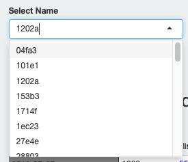

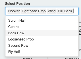
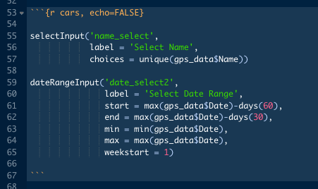
To create a selectInput widget we must provide three pieces of information: widget ID, ID to use in order to access the input; widget label, name which will appear above widget; choices which are the options we wish to select from. We also have a number of optional features:
- Selected
- Which sets the initial data selected
- Multiple
- If we wish to allow more than one option to be chosen
Date Input
dateInput
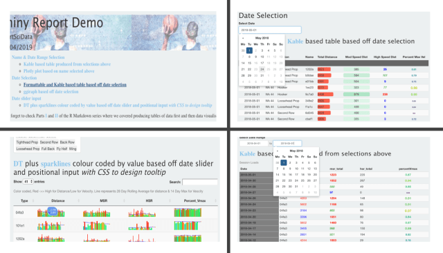
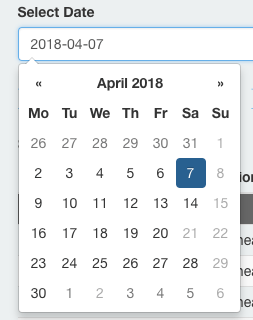
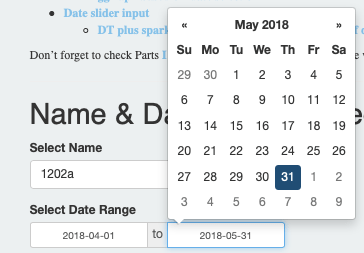
The shiny::dateInput() allows you to create a select input option which features a calendar, from which a date can be selected. This calendar selects a single date which can be used to filter a dataset.
dateRangeInput
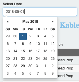
The shiny::dateRangeInput() allows you to create a select input option which features a minimum and maximum calendar input. This can filter a dataset between the maximum and minimum date values.
For both dateInput and dateRangeInput, we must provide two pieces of information initially:widget ID, ID to use in order to access the input; widget label, label which will appear above widget. However we have additional input here which I would suggest adding to aid the user.
dateInput has a number of features which can help ease the user find the data they are searching for:
- min/max
- Set the minimum and maximum date values shown.
- value
- Set the date to shown initially. If you are using the report on a daily basis setting this equal to the max date value means you report will always show the most recent data first.
- datesdisabled
- Deactivates certain dates so they cannot be selected.
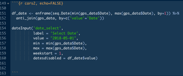
- To deactivate dates, we must create a list of dates first.
- Here we want to deactivate dates for with no data. To do this we create a list of dates from the minimum to maximum date value using
seq.date(). Then useanti_join()to filter out dates present in our data. Finally we setdatesdisabledequal to this list.
- weekstart
- Sets which day the week start on.
- 0 represents Sunday, while 6 is Saturday.
Similarly we have additional options for dateRangeInput:
- min/max
- Set the minimum and maximum date values shown.
- start/end
- Sets the initial start/end of the date range to be shown.
- We can set this to be the most recent 30 days using
lubridate::days().start = max(gps_data$Date)-days(30)-
end = max(gps_data$Date)
- weekstart
- As above.
sliderInput
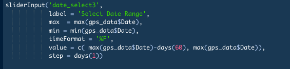
The shiny::sliderInput() allows you to create a slider based input option which features a minimum and maximum input. This option can be used with numerical and date based data. Both id and label must be filled along with min/max then we have a number of options available to us as well:
- timeformat
- Allows you to set the format if using date time data.
- value
- sets the initial range shown.
- As before we can set this to show most recent 30 days.
value = c( max(gps_data$Date)-(30), max(gps_data$Date))- Must be numeric vector with 2 values present.
- step
- Sets the interval at which the slider moves.
- animate
- We can set the slider to move along its range automatically using animate.
- Additional options are available through
shiny::animationOptions()- I wasn’t able to find a way to create a smooth transition between animations here so haven’t used it.
- If you have any advice, I’m all ears! At a guess it involves JavaScript which is definitely not my forte.
Render Options
In order for us to have elements which reactive to the shiny reactive inputs above, we have to change how we create them. Rather than build them when we create the report initially, we create as the users input occurs. To do this we wrap our feature (table or plot usually) in a render function. The type of feature and package that builds it will determine what the render function will. We will cover a number of them here.
Tables
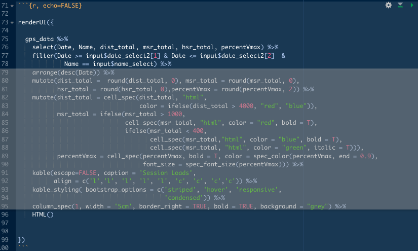
Previously we covered how to create tables using DT, kable and formatTable packages. While DThas it’s own render function, kable and formatTable have a small step to take before we can render.
- DT
- DT comes with own render function:
DT::renderDT(). In order to produce a table that is reactive to an input we must use the input to filter our data (example shown below for sparklines in DT).
- DT comes with own render function:
- Kable/formatTable
- While formatTable has it’s own render function,
formatTable::renderFormattable(), for Kable we must add a small bit to our script. Kable produces a table through HTML. This means we must format our table as HTML usingshiny::HTML()and then render usingshiny::renderUI() - Here we use the
name_selectinput to filter our data along with a date filter.date_select[1]&date_select[2]refer to the min and max set by our dateRangeInput. - Our table is created through a combination of
HTML()at the end combined withrenderUI()
- While formatTable has it’s own render function,
Plots
Previously we covered how to create plots using ggplot2, plotly and ggiraph packages. While ggplot objects can be rendered using the used shiny::renderPlot() function, both plotly and ggiraph have their own render functions.

Reactive Plot Guide
In order to prevent a reactive plot miscommunicating data as inputs change, it’s important to consider a number of elements.
- Set axis limits to be fixed.
- This prevents data being misinterpreted as the input changes.
- Otherwise data-points in the same position on the plot may have very different values as axis limits change.
- Similarly, if there are colour scales in your plot fix the min, max etc. values.
- Depending on your plot, you may need to use
ifelse()based functions to account for the reactivity. - Add/remove data that affects your plot, to check it works as intended with different amounts of data.
- Finally, check how the report looks on different platforms (laptop, mobile, tablet etc.). Plotly, when run through R, doesn’t seem to render well on mobile devices for example.
Reactive Plots
- ggplot
- ggplot can be rendered using
shiny::renderPlot()
- ggplot can be rendered using
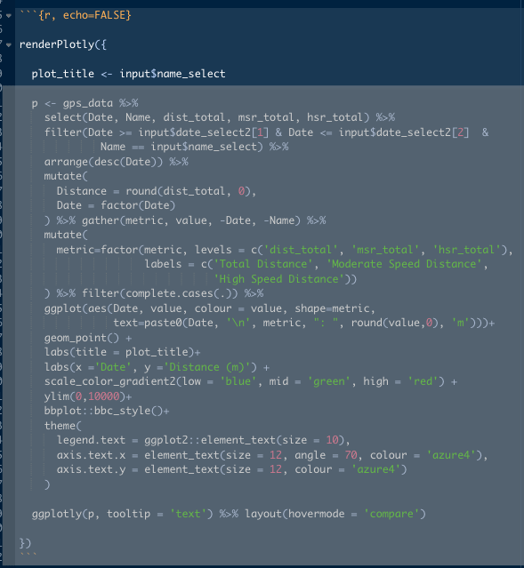
- Plotly
- Plotly comes with it own render function:
plotly::renderPlotly() - Here we use the
name_selectinput to create a title for our plot and, as before, to filter our data along with a date filter.
- Plotly comes with it own render function:
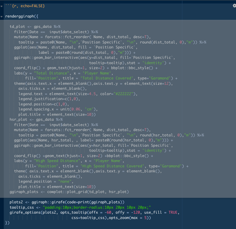
- ggiraph
- ggiraph comes with it own render function:
ggiraph::renderggiraph() - Here we filter our data using
data_selectbefore building plots through ggplot2 with ggiraph elements, then userenderggiraph()to build it.
- ggiraph comes with it own render function:
Intro To Sparklines Package
We can often be in a position of searching through longitudinal data or need ways to visualise longitudinal data for a number of individuals. One method of performing this is through sparklines. Sparklines are mini-graphs which visualise large datasets quickly. Within R, these can be created using the sparklines package, based off a JavaScript plugin. Here we will cover the basic steps needed to use sparklines in R and in a later blog go over steps to add meaning to your sparklines.
Sparklines
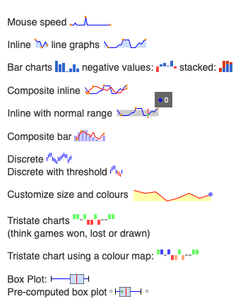
Sparklines are miniature graphs than can be used to quickly summarise data. We have a few options for the graph style we want to use: line; bar; boxplot; tristate among others.
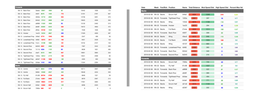
The basic usage of a sparkline is straightforward. Wrap a set of values in the sparkline()and then set the type of sparkline using type =call. However, a sparkline in isolation isn’t of great value. The main value in this package is the ability to embed sparklines in tables. For this example we look to embed them in a datatable using the DT package and then render into our report.
DT & Sparklines
Fortunately, sparklines plays very nicely with dplyr::summarise() which means we can create the sparklines as part of on a longer piping function.
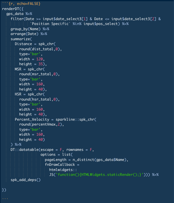
In the image above we combine sparklines with the DT package in order to create an interactive table with sparklines for our data. I will explain how to create it for one metric, this simply needs to be repeated for each additional metric then.
group_by(Name)- Creates grouped data frame by each individual present.
arrange(Date)- Ensures data is sorted chronologically before creating sparklines.
summarize(- Begin
dplyr::summarise()function.
- Begin
Distance = spk_chr(- Variable called
Distanceplus thesparkline::spa_chr()
- Variable called
round(dist_total,0),- Round our data to tidy the tooltip.
type='bar', width = 120, height = 35),- Set sparkline to bar and set height and width within our datatable.
- Repeat as desired for additional variables.
DT::datatable(escape = F, rownames = F, options = list(pageLength = n_distinct(gps_data$Name),- Following our summarise function we pipe into a datatable function as normal.
- escape must be set to FALSE here to ensure HTML objects (sparklines) will render properly.
dplyr::n_distinct()is used to set the table length to always show every everybody.
fnDrawCallback = htmlwidgets::JS('function(){HTMLWidgets.staticRender();}')))fnDrawCallbacksets the datatable to react to javascript inputs which are set in the javascript that follows.
spk_add_deps()- Adds sparkline tags to the HTML present in the datatable.

As mentioned previously, I will do a further blog on sparklines in R/DT. In the meantime, I found this answer on StackOverflow to be incredibly useful in getting started with them.
Markdown
While we are utilising R Markdown to build our reports, it relies on Markdown to create a large amount of the document. We can use Markdown to add and format text between our report elements. While we will cover a small number of elements here, you can read here or here for further options.
To add basic text to our report, we need only type as normal in the spaces between the code chunks.


We can add to this basic text through a few methods.
- Links:


- Italics:


Markdown also gives us the ability to add section headers to our documents. The number of hashtags sets the header level. The header levels then differ by text size within the final report. In addition to adding headers to the sections within the report, if you have your report includes a table of contents the headers and levels will be automatically added to it.
CSS Additions
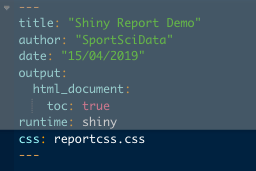
As we build our report, one aspect that is worth considering is the overall aesthetics of the final report. It’s important that it is visually appealing for the user while also looking to incorporate colours or images specific to your organisation. While we can manage some of this through our markdown document, using CSS allows more customisation. The easiest way to incorporate CSS is to create a txt file through RStudio and then save it as .css. We can then call this CSS file into our report through the YAML header. While I am by no means experienced with CSS and usually resort to a variation of “How to do X in CSS” in google, here are a few settings I found useful.
body{background-color:#ECF0F1;}- Background color.
h1, h2, h3, h4, h5, h6 {font-family: 'Open Sans', sans-serif;}- Font for all headers.
p, ul, li, a {font-family: 'Lora', serif;}- Font for all non-header text.
section-header{background-image:linear-gradient(rgba(255,255,255,0.5), rgba(255,255,255,0.5)),url(image.jpg); border-radius:10px 10px 10px 10px;}- Adds an image to the title header in the report
- Increases transparency so title info can be viewed
- Finally slightly curves the corners of the image.
- I have an additional feature in the image below which alters how links are interacted with in the report. It adds a slight transition as you mouse over or move away from it, the mouse pointer changes and the text highlights as well.
- Here is a nice guide to identifying CSS elements in your report.

In Closing
Hopefully I have show you additional steps we can take within R Markdown to add value for the end-user through shiny reactive elements, markdown and CSS. If you have thoughts or comments about the above, feel free to leave a comment below or through twitter @SportSciData. In the next article in this series, we will cover building a calendar heat map in R Markdown, then combine it with a shinyApp to build on the shiny reactive elements we covered here.
As mentioned above, a version of the report is available to view here, along with the script here. If you haven’t already, don’t forget to check out Part One and Two of the series where we looked at ways produce tables of data with R Markdown and then Data Visualisation. Thanks for reading!
Don’t forget to check how different reporting elements can be combined through a Shiny App as well!
