
An area of growing interest is how we can move away from reports that are paper or PDF based to allow for the user to interact it. This lets them ask questions of the data themselves while also moving in line with how a large amount of today’s information is consumed, through electronic devices. We have multiple options available to us; linked Excel sheet with slicers; PowerBI; Tableau; AMS system plus many similar systems. Here I want to show a method that many may not be too familiar with but one that really allows for customisation: R Markdown.
R Markdown allows you to produce documents in many formats including: Word; PDF; HTML and Shiny (See here a two-part post on creating PDF reports from R Markdown). We can combine elements of each to meet our needs. One such option we will look at here is to produce a notebook report which can be published online, a sample of which is available to view here (This sample is slightly slow to load as I have included too many reactive elements (react to user input) and could optimise the script further). How to create the sample report is available for download here along with the data used to create it. Over the next few blogs we will look at a few of the many options available to us through R Markdown, starting with how to use R Markdown and display data in a table format.
Intro to R Markdown
Initial Setup
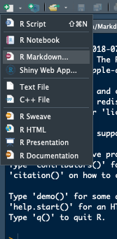
To start an RMarkdown document:
- Select the new file icon and then R Markdown
- In the options box alter the title and author if you wish, then select OK
- It will open with a sample document ready to run if you wish by selecting Knit at the top of the document.


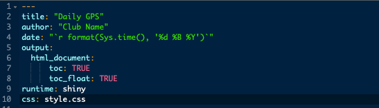
The section at the top of the document where title, author and date are set is called the YAML header which determines a number of global settings for your document. There are a number of changes we can make to this header which determine some of the global options for our report.
- Changing the date to
"which sets the date to whatever the date is when the document is produced.r format(Sys.time(), '%d %B %Y')" - Including
toc: TRUEadds a table a the top of our document.- Adding
toc_float: TRUEas well means the table of contents will be visible as you scroll down through the document.- Including HTML elements can have a negative affect on this option however where it is not visible.
- Adding
runtime: shinyallows you to use shiny elementscss: style.csswill add a separate CSS document to style your final output- You can also apply a theme to your document
Code Chunks
An R Markdown document is split into chunks with each chunk having text at the start that determines how influences the final document. The chunks appear in a slightly different colour to the space’s between them. Generally, the first chunk performs any data loading and initial manipulation, along with creating any custom functions for later in the document. The start of a chunk is determined by three backticks, “`, plus two curly, {}, brackets, within which the code type output of the chunk is set. Finally we close the chunk with another three backticks.

If we look at the two chunks shown below, the first has r cars at the start of the chunk. This is saying r script will be used and the chunk name is cars. When we run the chunk we get the summary information however we also see the r script. This can be prevented by including echoe=FALSE within the brackets at the beginning as the second chunk has. A code chunk will output whatever the final object referenced within it is, this can be a plot, table of data, image etc.

How To Output And Format A Table Of Data.
If we take the chunk in the above image with summary(cars)in it and remove the summary function so we are left with carsas the only content in our chunk, the output is the first ten rows of our data. We have a few options available as to how we can tidy this up to make the output more usable:
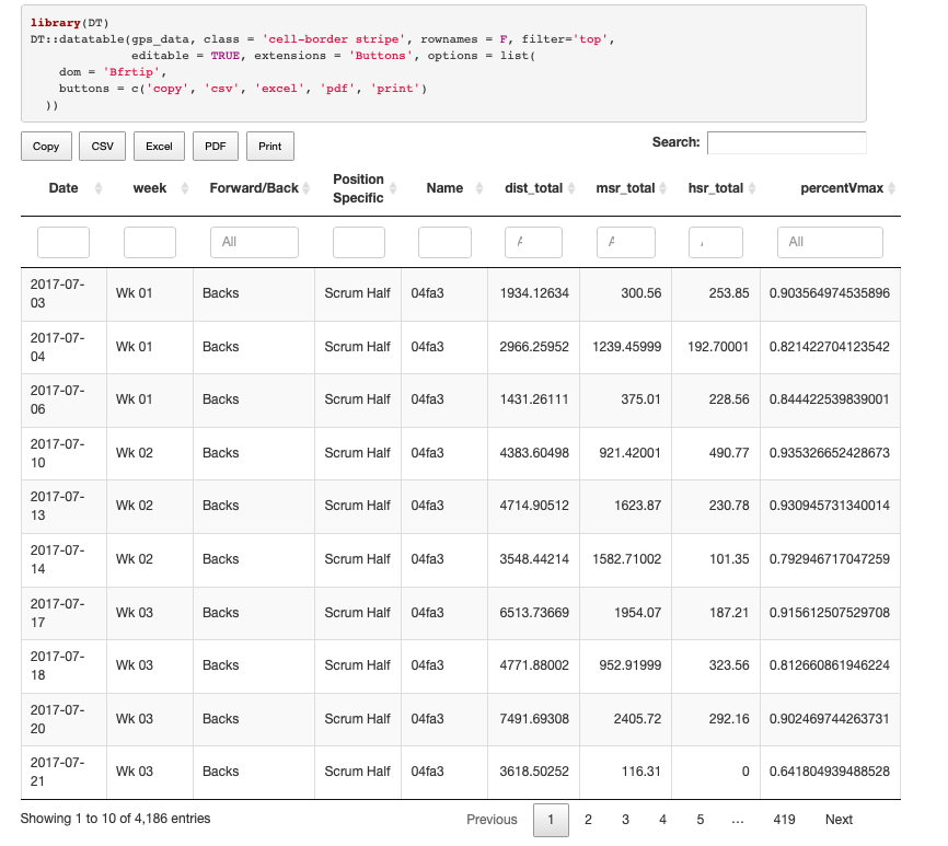
- Using data tables through the DT package
- Format through the Kable and Formatable packages
- Combining the above
DT Package
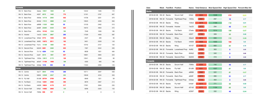
For this example we are going to use the sample dataset used to create the report linked earlier which can be dowloaded from here on GitHub.
If we run a basic datatable(gps_data)the output is similar to running it without datable, only slightly nicer format plus some basic options.

However we have multiple ways to add to our table through the DT package:
rownames = FALSEremoves the row numberfilter = "top"adds filter options to each column (filter can be “top” or “bottom”)class = 'cell-border stripe'adds some basic styling to the table, more options available hereeditable = TRUEallows the table to be edited in the final outputcolnames = c("col1","col2"....)changes column names in the final outputextensions = 'Buttons', options = list(dom = 'Bfrtip', buttons = c('copy', 'csv', 'excel', 'pdf', 'print')adds buttons at the top of the table which allow the user to export the data- Many more options are available to view here
Using a few of the above we can produce a table like below:
There are a number of additional options available to format a data table in various manners within the DT package also. However we can also use the kableExtra package to format a table as well.
Kable/KableExtra
Kable is another option when producing tables in R Markdown, along with the extension kableExtra it allows more formatting and styling of a table. We can use these packages to produce a simple table by using their default settings.

However, we can do a lot more to add meaning to the data while also making the table easier to use. Within the kable() and kable_styling()functions we can define global functions for our table.
bootstrap_options = c('striped', 'hover', 'responsive', 'condensed')- Striped makes every second row a slightly different colour
- Hover highlights a row if you mouse over it
- Responsive makes a table scrollable on small screens or when zoomed it
- Condensed reduces the row height slightly to allow more data on screen
full_width=TRUE- TRUE is the default setting for this function which means the table will expand to use the full width of the output page, however if there is only a small number of columns changing to FALSE may look better.
- If set to FALSE you can set the on-screen position using
position="left"or similar.
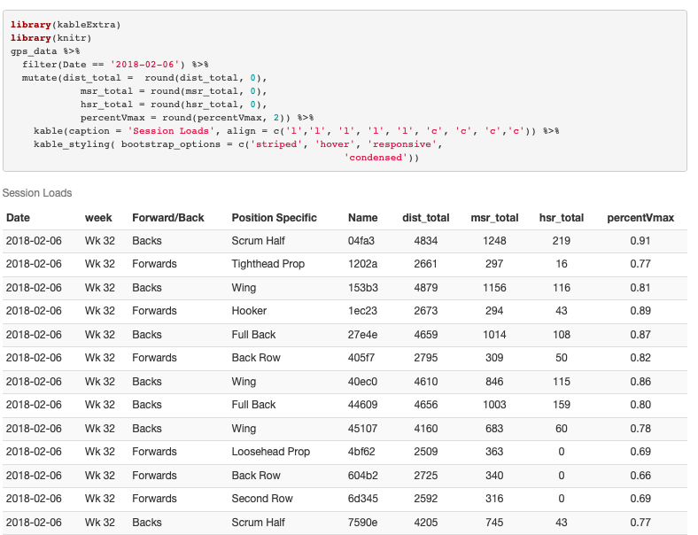
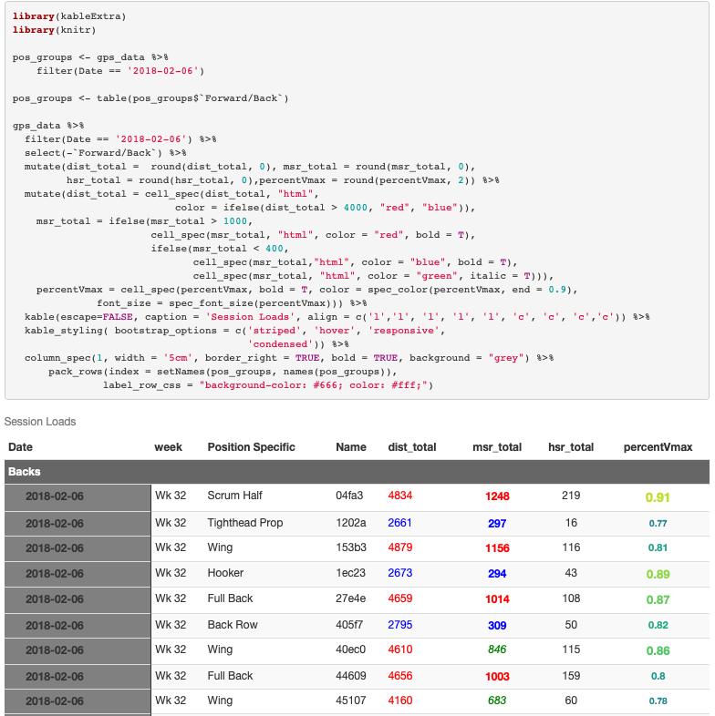
fixed_thead=TRUEfixes the table headers so they remain viewable as you scroll with a long tablecaption = 'Session Loads'sets a caption at the top of the tablealign = c('l','l', 'l', 'l', 'l', 'c', 'c', 'c', 'c')sets columns as left, right or centre aligned.
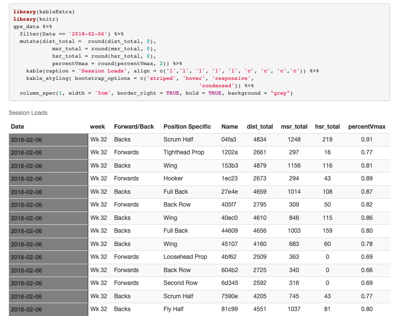
While the above defined settings for the table as a whole, within the column_spec()function we can define settings for individual columns
width = "5cm"sets column widthbold = TRUEsets the text as boldborder_right=TRUEas a border on the right side of the columnbackground = "grey"sets the background colour to grey
Similar options are available to format by rows with the row_spec() function. However if you are working with a large table, having too many column_spec() and/or row_spec()can lead to the table being both slow to deploy and load.
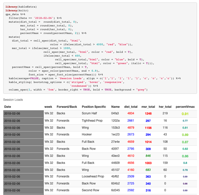
Finally, and potentially of most interest, kableExtra allows for conditional formatting of cells through the cell_spec()function. However, this function operates differently as it must be applied before the table is generated.
-
dist_total = cell_spec(dist_total, "html", color = ifelse(dist_total > 4000, "red", "blue"))- Sets a conditional colour on the distances over and under 4000m through an
ifelsestatement within thecell_specfunction
- Sets a conditional colour on the distances over and under 4000m through an
msr_total = ifelse(msr_total > 1000, cell_spec(msr_total, "html", color = "red", bold = T), ifelse(msr_total < 400, cell_spec(msr_total,"html", color = "blue", bold = T), cell_spec(msr_total, "html", color = "green", italic = T)))- Sets a conditional colour on the moderate speed distance with thresholds of 1000m and 400m through a nested
ifelsestatement and multiplecell_specfunctions
- Sets a conditional colour on the moderate speed distance with thresholds of 1000m and 400m through a nested
percentVmax = cell_spec(percentVmax, bold = T, color = spec_color(percentVmax, end = 0.9), font_size = spec_font_size(percentVmax))- Here we set the colour and font size of the column by the value of the cell. The greater the value, the larger the text and brighter the colour.
- Further options are available within
spec_coloras to how the colour will change
Further formatting options from the kableExtra package are available to view here. We have one last kableExtra function to look at which is a method of grouping data, similar to how you might in a pivot table in Excel. For our dataset we will group based on whether a player is a forward or a back.
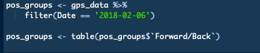
This step must be carried out on the the data that will be used to create the table. This means, for our example where we filter the data, we must filter our data before beginning to create our groups. We then use the table()function to create a count of the different factor levels within the forward/back column.
Once we have our grouped data created, we have two final steps to take. First we must remove the forward/back column from our dataset, this can be done using a select()at the start of our dplyr chain. Then we add the following pack_rows()function to the end of our table.
pack_rows(index = setNames(pos_groups, names(pos_groups))- If you are comfortable with CSS you can format the grouping rows though the
label_row_csscall within thepack_rows - You can set the order of the grouping variable by changing it to a factor and setting the levels prior to the table function.
- If you are comfortable with CSS you can format the grouping rows though the
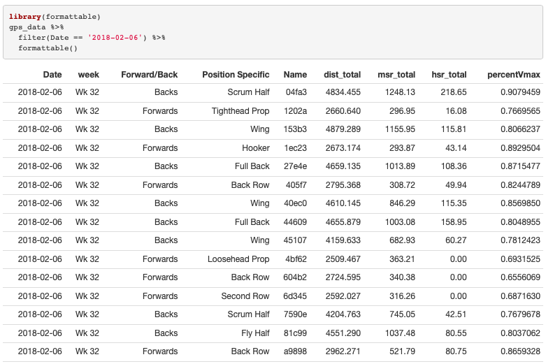
FormatTable
Finally we will look at the formatTable package. Again the default settings in this package can produce a usable table of data.
But we can do much better than the above to help the end user interrogate the data.
- As before we have an
align()function this time, to avoid too much repetition we will use therep()within it to prevent the need to type it all outalign = c(rep('l', 5), rep('c', 4)
dist_total = color_bar("#FA614B")creates a colour bar for the distance column- The column alignment sets where the bar will originate from, i.e. a left aligned column will have a bar that starts on the left and grows towards the right. However if you are dealing with data that may have zero values, then centre aligned is best.
percentVmax= percentmsr_total = color_tile("#DeF7E9", "#71CA97")formats the colour of the background area where you can set the high and low colours.- Hex codes are being used here to set the colour
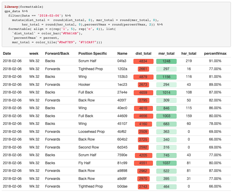
KableExtra and formatTable can be combined to produce a table of data which allows the user to draw meaning from in a quick and efficient manner. However much of the formatting must be done using dplyr:: mutate rather than within the the kable or formattablefunctions
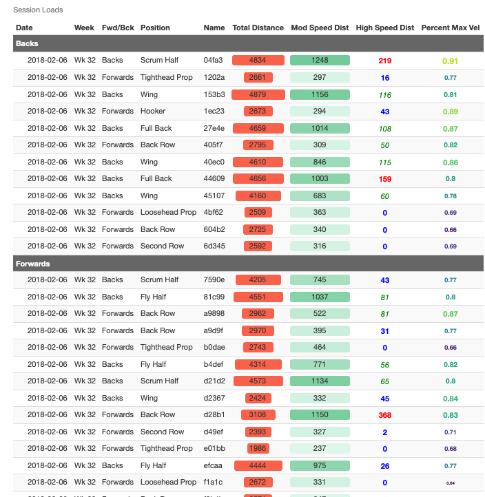
That’s all for now, next up we will look at some of the options for graphing data with R Markdown. The product of the above work is available to view here while the script and data are both here.
Anything I have left out above feel free to comment below or on twitter @SportSciData
