
As practitioners we often work with people that may not have the same understanding or interest in our areas as we do. While constant reinforcement can lead to a level of buy-in, at times it takes presenting the information in new or different formats to gain this buy-in. One of the ways we can look to alter how we present is by utilising different graph formats over time to present the same data. While this can be performed to a degree in Excel, changing format can often lead to a range of issues (graph colours, axis ticks/fonts, label positions etc.) that makes it a very time consuming task. Much of these can be overcome by using R to plot graphs where we can alter the chart type quickly without altering the rest of the formatting present within.
Once we become more familiar with the functions of ggplot we can start to really customise both the visuals and data represented within a plot. If you are happy with these visuals, repeating them across multiple plot formats requires minimal modification in the script
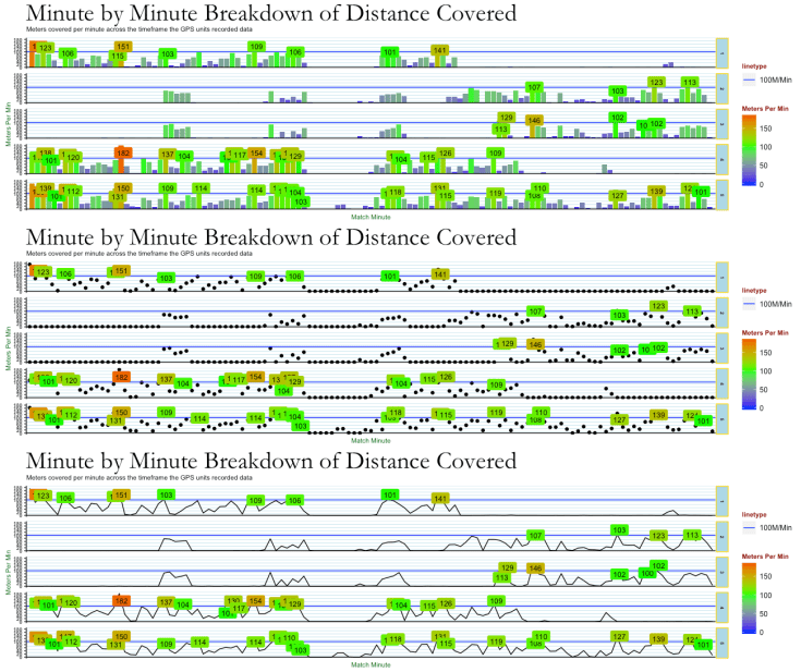
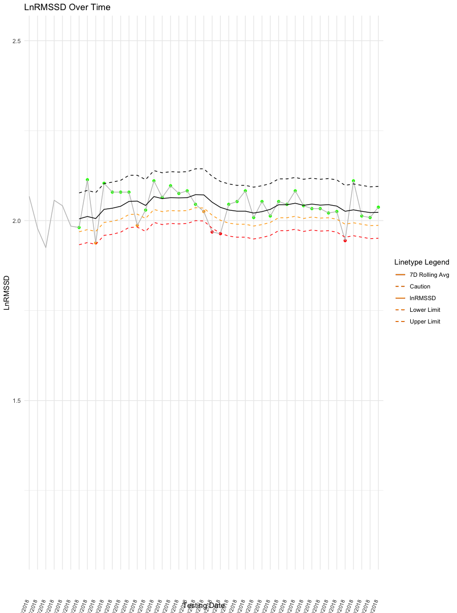
One of the areas where I feel R has a real advantage over Excel is the ability to format data within the plots where we can apply filters to the data we want to show within the plot within altering the base data. An example would be in the above plot where only data points above 100m.min are labelled or below where we have used a traffic light approach to colour the HRV data points.
Similarly, while Excel has the ability to produce individual plots, being in the position where you have a large number of athletes trying to produce and analyse plots for each can be a thankless task and often too time consuming to be worthwhile. R has a number of solutions to this issues.
First of all we have the ability to create facets within our plots where the same plot can be recreated a number of times, yet this has limited value in team environments where we can deal 50+ athletes regularly. This is where a package called ggplus offers the facet_multiple function where we can set the number of facets we wish to group together and through RMarkdown (more on Markdown coming up soon) print to a pdf or word document to view (I have used this to produce upto 50 plots on a regular basis).
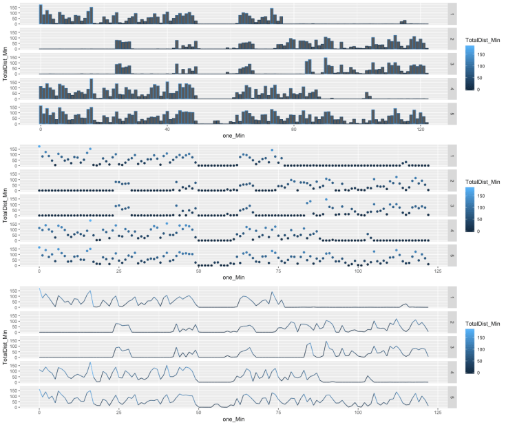
ggplot2/r gives us access to both different plot types as well as the ability to combine multiple plot types in a single plot. There are a wide range of alternative plot types available to view here along with the script to produce them. Plotting multiple graphs together can be useful to give meaning to data while also providing a more attractive visual. Finally the plotly package also gives us the ability to make plots interactive which can be a real advantage with athletes that can live on their phones/ipads
Of course you can always get carried away and produce some impressively time consuming yet pointless plots as well 😉

Going forward, we will start to break down the script we can use to make plots another tool in our arsenal to give data more meaning.
