
Having briefly covered why use R to create plots now we will look at creating plots in R and the ggplot2 package. Let’s start with the data we created in this blog where we broke down a single GPS export into minute by minute distance along with some speed threshold based data.
We will start with a simple bar chart using the follow script:
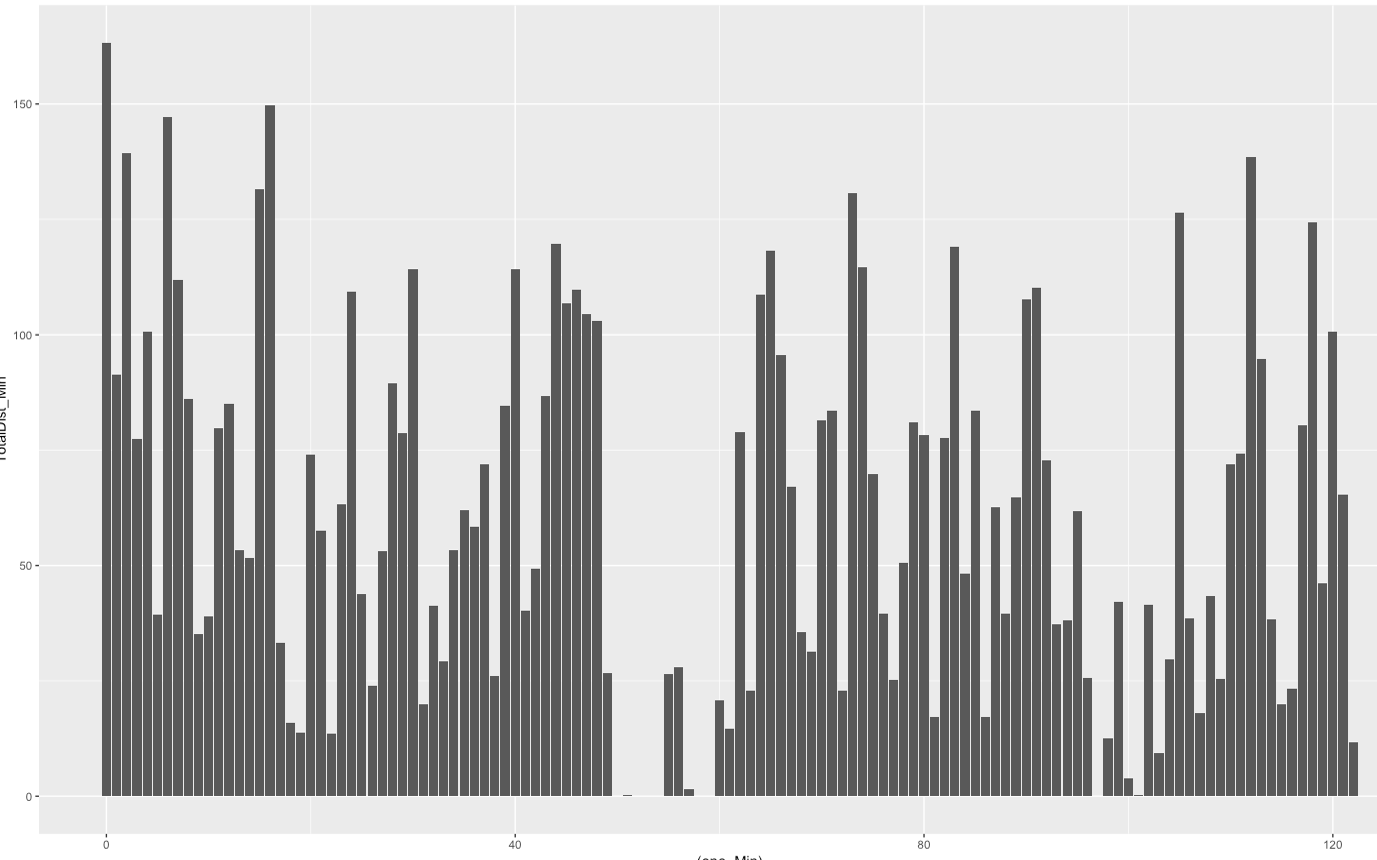
ggplot(data=Min_by_min, aes(x=one_Min, y=TotalDist_Min))+
geom_bar(stat = 'identity')
- In the above we are mapping the data to the plot in the first line where
data=assigns the dataframe we want to reference, then within theaeswe setx=as the data for the x-axis andy=as the y-axis. If we were to plot just the first line we would have an empty plot as we haven’t defined how we want the data plotted yet. geom_baris the function for a barplot however we must usestat="identity"in order to use the actual values within the y column and not use any statistical function or count metric.
While the above is quick way of plotting the data to give us an overview, in terms of visualising the data its lacking. Here are some of the areas we will look to improve upon:
- Lack of colour
- X and Y axis labels are hard to see and have large ticks intervals
- No indication of high or low values, through colour or labels
- No plot title
Luckily ggplot comes with some built in themes we can use to set some of the smaller details within a plot, with theme_bw or theme_minimal being my go to.
ggplot(Min_by_min, aes(one_Min, TotalDist_Min))+geom_bar(stat = 'identity')+theme_minimal()- Adding a small piece to the end can make a large difference to the overall plot
- Also although
data=,x=andy=were present in the earlier script, if we are referencing them within theggplotfunction itself we don’t usually need to type those in.
Next we need some colour so we don’t have people looking at grey bars all day.
To add colour we have a choice of including it within the aesthetic or outside. Inside means we are mapping the colour the data, outside means we are mapping it to the plot object. Depending on the type of plot we are using we can either use colour= (either American or European spelling will work)or fill=, for a barplot colour= affect the outline of the bars whereas fill= will fill the bars with colour. ggplotwill also automatically apply a colour gradient if it thinks the Y-values warrant it. For our plot we will do the following:
ggplot(Min_by_min,aes(one_Min,TotalDist_Min,fill=TotalDist_Min)+geom_bar(stat = 'identity')+
theme_minimal()

I mentioned earlier how the X and Y axis labels didn’t look the best, however the solution to the X-axis isn’t the most obvious. As the minute number column, one_Min, is minutes in numbers, ggplot is reading it as a numerical variable, however from our perspective it is a factor variable,i.e categorical in nature. We can either change the column in the dataframe itself to a factor variable through:
raw_gps$one_Min <- factor(raw_gps$one_Min)
Or we can carry this out within the script for the plot itself:
ggplot(Min_by_min,aes(factor(one_Min),TotalDist_Min,fill=TotalDist_Min)+geom_bar(stat = 'identity')+
theme_minimal()- Although a bit crowded we now have the full minutes available to view on the x-axis
To set the tick frequency on y-axis we will use the scale_y_continuous function. This lets us determine minimum, maximum and the tick interval.
ggplot(Min_by_min, aes(factor(one_Min), TotalDist_Min, fill=TotalDist_Min))+geom_bar(stat = 'identity')+
scale_y_continuous(breaks=seq(0,220,20))+
theme_minimal()- In the
scale_y_continuouswe are asking the minimum value to be zero, maximum at 220 and a tick interval of 20
While we are at it lets add some better colours to the plot to really emphasise high/low points. We can do this using scale_colour_gradient or in our case scale_colour_gradient2. While both perform very similar functions, the second will allow us to set the midpoint of our colour scale, whereas the first only allows high and low points.
ggplot(Min_by_min, aes(factor(one_Min), TotalDist_Min, fill=TotalDist_Min))+
geom_bar(stat = 'identity')+
scale_y_continuous(breaks=seq(0,220,20))+
scale_fill_gradient2(low='blue', mid='green', high='red', midpoint = 100, name='Meters Per Min')+
theme_minimal()
- Here we using
scale_colour_gradient2to set what colour we would like the lowest, highest and mid points to be while also setting what datapoint counts as the midpoint and setting a title to the scale legend - Note what you set as the midpoint here will depend both on your data and your thoughts as to what high and low within it is

Finally we will add three last pieces to our plot: main title, x-axis and y-axis labels; alter x-axis scale to make it visible and finally add some data labels to highlight some points of potential interest.
Labs will allow us to change the x and y axis titles along with the main title for us. For the x-axis scale we will go in and alter the plot theme using theme, before using geom_text along with an ifelse statement to label certain data points in the plot.
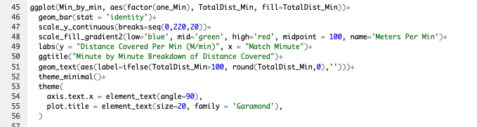
ggplot(Min_by_min, aes(factor(one_Min), TotalDist_Min, fill=TotalDist_Min)) +
geom_bar(stat = 'identity') +
scale_y_continuous(breaks=seq(0,220,20)) +
scale_fill_gradient2(low='blue', mid='green', high='red', midpoint = 100, name='Meters Per Min') +
labs(y = "Distance Covered Per Min (M/min)",x = "Match Minute", title ="Minute by Minute Breakdown of Distance Covered") +
geom_text(aes(label=ifelse(TotalDist_Min>100, round(TotalDist_Min,0),''))) +
theme_minimal() +
theme(
axis.text.x = element_text(angle=90),plot.title = element_text(size=20 family = 'Garamond'))
- While
labsis more self- explanatory,geom_textandthemeneed some explaining
- First the
ifelsestatement:ifelse(TotalDist_Min>100, round(TotalDist_Min,0),'')- This is similar to an
ifformula in Excel where we are asking it to look at theTotalDist_Mincolumn, if it is over 100 produce a value rounded to zero decimal places, if it is not return blank.
- The
labelwithin theaestheticsofgeom_textare then made equal to theifelsestatement which gives us our datapoint above 100m.min. - While we have used
theme_minimalto determine a number of visual settings within the plot we can also usethemeto go in an tweak them ourselves. Here went to change the angle the x-axis scale is showing at usingaxis.text.xwithinthemeitself (I also added a line to format the main title). Within that argument we changed the text angle to 90 degrees. I found 65 degrees or higher prevent the labels overlapping but feel free to play around with your own labels
So our final masterpiece looks like this (not a bad effort for about ten lines of code):
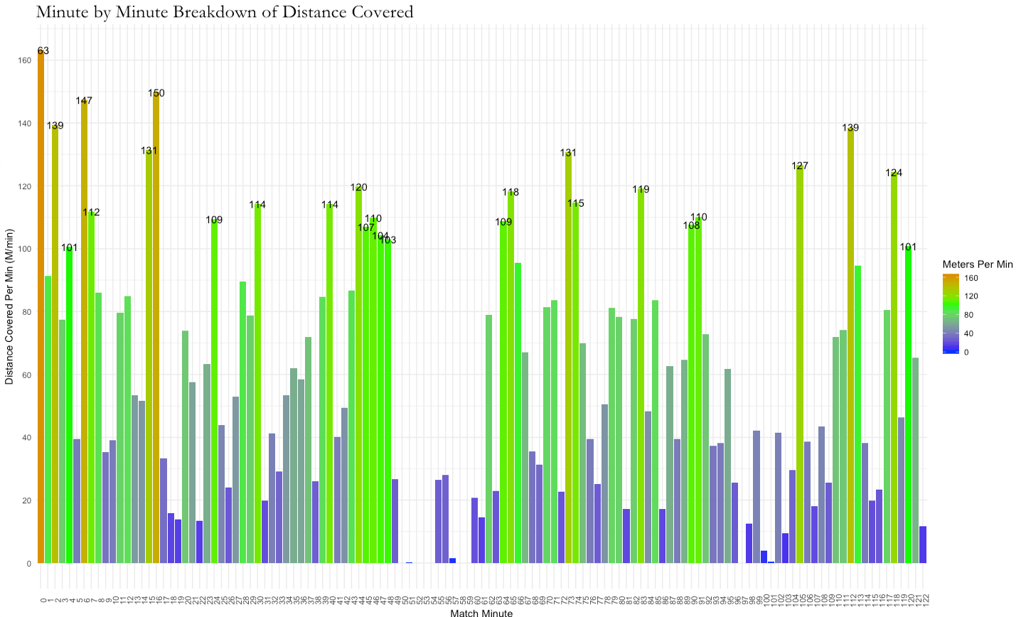
Where we started to where we finished

Todays plot script:
Hopefully this has given an indication as to how we can start to add layers to our plots piece-by-piece in addition to carrying out some data analysis within the plot itself as well. This is also showing why using R to analyse data can be very efficient. With the plot added to the end of the raw data analysis, now in less than a minute we can import, analyse and plot a minute by minute break-down of a game or training. How long would that take in a different software?
PS – Heres some frequent pitfalls when plotting in r:
- Not closing brackets in the right places or leaving one of the closing brackets out
- Leaving out the plus
+sign between each layer so they are not connected - Having arguments which should be within the
aesoutside of it or vice-versa - Missing commas between arguments or missing quotation marks
