

Previously we looked at how to setup and format a Markdown document in RStudio along with the initial HRV data wrangling. Now we will start to do our reporting on the data, first we must put together our plot with ggplot2, then design the table with kable and kableExtra, before finally producing our individual plots with ggplus.
Code Chunk 1: Setup (Building Our Plot)
Building our plot with take place in the initial code chunk where we will name and call on later on to produce our plots. Before we go into building our plot we have to set up some of the general aesthetics (or theme) for the plot as when we produce plots later much of the text such as labels or titles will not be viewable without this step.
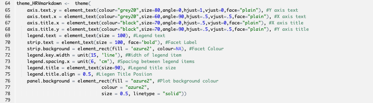
Rather than go though each individual element I have added a comment to explain what they do, much of it is setting text size and colour for different elements. We will then call on it within our plot to set the different theme elements.
We have one last step to add before we can build our plot. Previously we set our data up in a long format where we had one column specifying what the data is (the “key” column) and another with the data. We can set the key column up as a factor variable which will allow us to set the label shown in the plot as well as the the line colour and type easily.

Finally we can start to build our plot Here we will name the plot “A” so we can call on it later in the script. As we haven’t looked at building plots much yet lets take a look at each plot layer and what it adds to the plot:

ggplot- Setting data frame, x and y axis data along with how we want to assign different aesthetics to the different types of HRV data.
geom_line- Setting a line graph with different lines for HRV data plus line size.
geom_point- Adding dots at each data point . This allows us see both trends from the lines and actual datapoint from the dots. Size also set.
labs- Setting both x and y axis titles. Overall plot title is set through markdown later. Adding the
\nat the start or end adds a line break to the titles ensuring there is space between it and the axis.
- Setting both x and y axis titles. Overall plot title is set through markdown later. Adding the
scale_colour_manual/scale_linetype_manual- These set the linetype and line colour for our data. As we set it to a factor variable we don’t need to specify each line, simply apply the colour/linetype in the order of the levels set earlier. Without this ggplot2 will set them all automatically as different to each other.
geom_hline- Includes a horizontal line at the y-axis value of 1.1. I included this add to add a visual separation between plots which I feel is good to have when we are producing many plots. I picked the value by looking at the data and choosing a value less than the lowest in the data.
alphasets transparency of the object it is applied to.
- Includes a horizontal line at the y-axis value of 1.1. I included this add to add a visual separation between plots which I feel is good to have when we are producing many plots. I picked the value by looking at the data and choosing a value less than the lowest in the data.
geom_label_repel- Adds labels for the data points. Using this specific layer means ggplot tries to ensure labels do not overlap. Within the aesthetics I have added an
ifelsestatement to only show labels for the daily transformed rMSSD data. Without this it would show labels for every data point including the three limits and rolling average, this would lead to a very cramped plot!
- Adds labels for the data points. Using this specific layer means ggplot tries to ensure labels do not overlap. Within the aesthetics I have added an
theme_HRVMarkdown- Format the plot according to the theme we made earlier.
Code Chunk 2: Table
Next we will build our table showing the most recent data. Before we start we add to the space between code chunks to set some formatting.

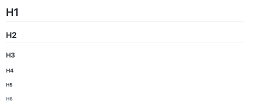
Having the \pagebreakdoes what it sounds like and ensures the table starts on the first page after the title page rather than the title page itself. ##Recent Datais setting a heading for the next section. You have options the it comes to the heading size as follows
- # H1
- ## H2
- ###H3
- ####H4
- #####H5
- ######H6
To set the code chunk up we include warning=Fto prevent warnings showing in our final document, echo=Fto prevent any code showing and then results='asis'which allows us show text (our table in this case) in the final output.
Recent Data Table
Creating the data table will be broken into three steps here; filtering and formatting the data; rounding the dataframe; building the data table output.

First we create list of column names so that the output has names that easily understood. Next we start to filter our original dataset that was in the wide format to create the HRV_recentdataframe.
rename_all- renames all columns.
group_by- Sets
PlayerNameas a grouping variable
- Sets
filter- Filtering by the most recent data using the
maxfunction
- Filtering by the most recent data using the
ungroup- Including this at the end is a precaution to ensure the grouping doesn’t continue into the next parts of the script

Next we create a function which will round the whole dataframe. By doing this it means we do not have to apply the round function to each column separately. Here we have rounded each column to two decimal places, without this step our table would show different decimal places for each column depending on the functions we applied to create them. This is a useful step anytime we are either creating tables or showing labels on a plot.

Finally we start to build our table using the kableExtra package. Similar to our plot let’s break it down into the different steps.
mutate&cell_spec- Here we use
mutateto affect column aesthetics usingcell_spec. In the above examples we are setting text colour in thePlayerNameandLnRMSSDcolumns. Similar to how we usedifelsewith the labels earlier, here we apply a conditional colour to the text. IflnRMSSDis less thanlowerlimitit is red, if less thanCautionit is orange, for everything else black. This is repeated forLnRMSSDwith the slight difference that we make “good” scores green.
- Here we use
select- Setting which columns we want to keep in out table if all are not required.
kable- Setting overall table formatting.
captionsets table title.longtableadds small gaps to your table every 5 rows,booktabsformats the headings of your table to make then look nicer,escapeensures any of our formatting script doesn’t show in the final table.
- Setting overall table formatting.
kable_stylinglatex_optionsstripedapplies a light blue colour to every second rowrepeat_headerrepeats the table title if table extends to additional pagesscale_downensures table will always have correct width and font size to fit on a single page.
full_widthspreads the table to the page width if it is small
column_spec- Affects specific columns, here we look at the first column, set its width to create space between it and the second column then have a border on the right side of it.

Code Chunk 3: Plots
This will be the quickest part of the whole script I assure you!
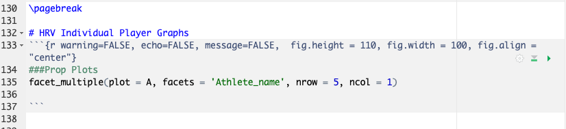
Similar to before we include a page break and section title. In setting up the code chunk we have some additional options which format plot height, width and alignment. These may take some fine-tuning based on the plot you are using.
facet_multiple from ggplus is the function we use to add multiple faceted plots. As ggplus is under construction in order to install it, it must come from GitHub rather than cran-r, using the following: devtools::install_github("guiastrennec/ggplus")
Within facet_multiple we call on the plot we made earlier, A, then use Athlete_name as our faceting variable, finally we set the number of rows and columns per plot. Again the rows and columns will depend on the type of plot you are producing. In my case, this produces 11 pages with 5 plots showing per page.
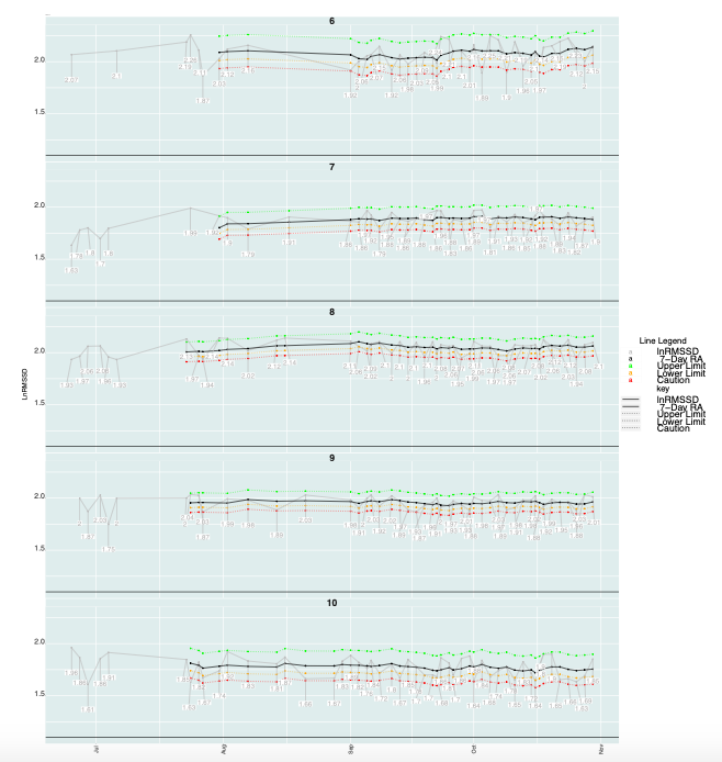
Note: ggplus doesn't allow for the same level of detail as ggplot on its own does as such the more complicated the plot, the more tweaking ay be needed for ggplus to accept. Similarly producing the pdf through latex can run into issues for some special characters within the text, for me using underscores, _, stopped the pdf from producing.

PS - Some common issues I have had when producing pdfs through markdown in the above manner:
As mentioned issues with either ggplus or latex not recognising some aspect
Plot formatting leading to it being unreadable.
Overlapping rows in the table
Not having the echo or warning set to FALSE for the code chunks
If you try to copy and past code chunks to speed up the setup of them, make sure only one has setup in it or else it won't work.
See below for the full markdown script used to produce the sample pdf from the first blog. Unfortunately I had to add it as a word document as wordpress do not allow markdown documents to be uploaded.
